The architect's dream home
In Aspenäs outside Gothenburg, we have built a beautiful kitchen where the functional meets the handmade in perfect harmony. Here it becomes clear that something magical can happen in contrasts if you have a feeling for it.
When you work with designing stylish and smart interiors for everything from hotels to offices, it probably itches a little extra to plan your own, well-thought-out, home to yourself. For Hanna Bolin, interior designer at Kanozi Architects, it was a dream come true when she built and decorated the house in Aspenäs outside Gothenburg for herself and her family.
See more of our wooden kitchen inspiration here.
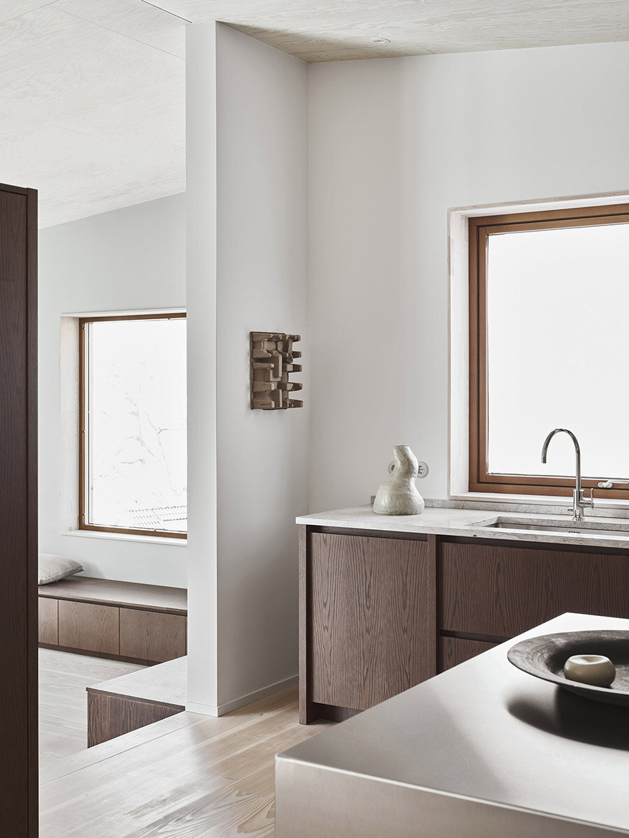
In the home there are several different shades of wood. The light, white pigmented oak in the ceiling, on the floor and on the inside of the kitchen cabinets. The dark brown on the outside of the kitchen cabinets, all the home's wardrobes and on the site-built bench in the dining room that has the same drawers as the kitchen counter.
That Hanna loves craftsmanship and natural materials can be seen on the exterior of the beautiful house, which is clad in cedar wood shavings.
Even before you step into the house, you can sense Hanna's love of tactile materials and crafts. The house is clad in beautiful cedar shavings and has been designed to fit perfectly on the steep plot located outside Gothenburg.
The kitchen island and the dark brown kitchen are accompanied by the slightly lighter and warmer brown tone around the windows. The grain in the wood softens the impression of the large bright room and becomes a beautiful contrast to the stainless steel kitchen island, the fan cover and the white walls.
The room would have the characteristics of both a furnished room and a functional kitchen. All parts of the kitchen are therefore designed so that they are experienced as furniture - furniture that is tolerable to look at.
The first thing you see when you step into the hall is the large, welcoming kitchen. Here, Hanna's interests in cooking, aesthetics and crafts unite. In the middle of the room is a large kitchen island in stainless steel with pull-out drawers with push function. It was important for Hanna to have plenty of function in the kitchen because the whole family appreciates food prepared from scratch and home-baked bread and pastries. And nothing is as functional as a large stainless steel kitchen island?
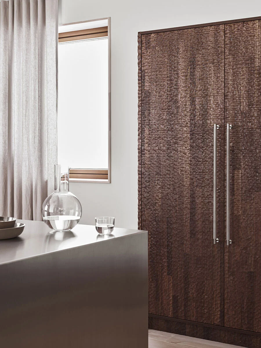
One goal of the interior was to create feeling through contrasts. The hand-carved, solid wooden cabinet and the adjacent stainless steel kitchen island are good examples of how successful this can be. Despite their differences, they fit together like a glove.
The house consists of two floors and two more mezzanines. The minimalist design with straight lines and white walls is softened by the wooden roof, plank floor and plaster around the stove.
Another example of the contrasts in the home is the hand-carved cabinet that is fitted with solid stainless steel fittings from Buster and Punch.
On each side of the kitchen island there are free-standing cabinets, one with wooden shutters in stained oak and the solid hand-carved one. The cabinet with the doors hides, among other things, a microwave and oven and the doors have a pocket door function. When preparing dinner, just fold the doors in the cabinet and the oven and other smart electronics are immediately accessible. If you later want to calm down the impression, just close the doors again. The hand-carved cabinet on the opposite side also hides appliances like fridge and freezer.
It was important for Hanna that the kitchen counter did not go all the way from wall to wall and that the kitchen should be without plinths. Since the kitchen is the first thing you encounter when you step into the house, it, together with the magnificent view, sets the whole feeling.
The gray limestone Thala gray was chosen for its cool shade which nicely contrasts with the warm, dark oak on the doors.
Along the wall at an angle to the two cabinets is a long, extra deep, kitchen counter that is divided into six sections with pull-out drawers in the same dark brown oak as the pocket door cabinet. Between the drawers there are wide solid oak frames that give a feeling of weight and craftsmanship. A large sink has been placed on the left side of the bench under a window and to the right is at the same time an extra wide induction hob with a large stainless steel fan cover from Fjäråskupan.
From the kitchen you enter the dining room via three steps. Along the wall there is a bench with the same type of drawers as in the kitchen. This connects the rooms in a nice way.
The sink and stove are extra wide and the worktop extra deep. Everything to facilitate cooking and to keep the kitchen clean. Along the wall is a low splash guard whose dimension matches the frames between the kitchen doors.
The long row of benches stretches almost along the entire wall, but on each side Hanna has chosen to leave some air. She has also chosen not to have any plinths at the bottom.
Since the kitchen is the first thing that meets visitors when they come to the house, it was necessary to put the right feeling from the start.
- I wanted to blur the line between a functional kitchen and a furnished room, Hanna explains.
The house is home to two adults and three children and everyone is interested in cooking and baking. Therefore, function in the kitchen was important. The center of the room, the large stainless steel kitchen island, allows all kinds of wear and has been dimensioned to facilitate and encourage joyful cooking. Get inspired by more stainless steel kitchen ideas.
The frames between the doors are extra wide and no fittings are needed because you can easily grab the door. Under the stove there is an open shelf that is perfect for pots and pans. Above the kitchen counter are two electrical outlets and a lamp button. All three are in gray porcelain and match perfectly with the limestone slab.
In addition to the kitchen being beautiful, functional and partly feeling like a furnished room, Hanna wanted to create feeling by using contrasts between materials, colors and expressions. She chose to build a wooden kitchen because it is a warm and lively material that breaks off in the modern, minimalist house.
The limestone and the stainless steel details in the kitchen were then chosen to contrast the warmth of the wood and add a sense of utility kitchen. This has then been further contrasted with a touch of the handmade and rustic that you find in the hand-carved cabinet, the wide frames in the kitchen counter and the upholstered insides of cabinets and doors. Despite the fact that the materials and styles are so different, they all fit together perfectly and together they form a kitchen dream beyond the ordinary.
- I am most satisfied with the kitchen counter, where we did not compromise at all and it was fun to experiment together to the perfect width of the frames and to choose a stain that was dark but still showed the grain of the wood, Hanna answers the question of what she is most content with.
Photo: Andrea Papini Styling: Sarah Widman
On our Instagram @nordiskakok you will find all our latest kitchen projects. Link here
On Pinterest, we have created an entire board with all our wooden kitchens, here you will also find the latest inspiration for wall paint, faucets, tables and chairs! Link here


