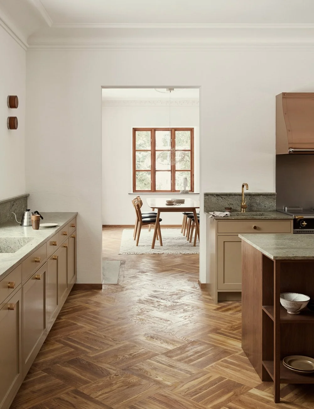
Mira Fröling’s light oak kitchen
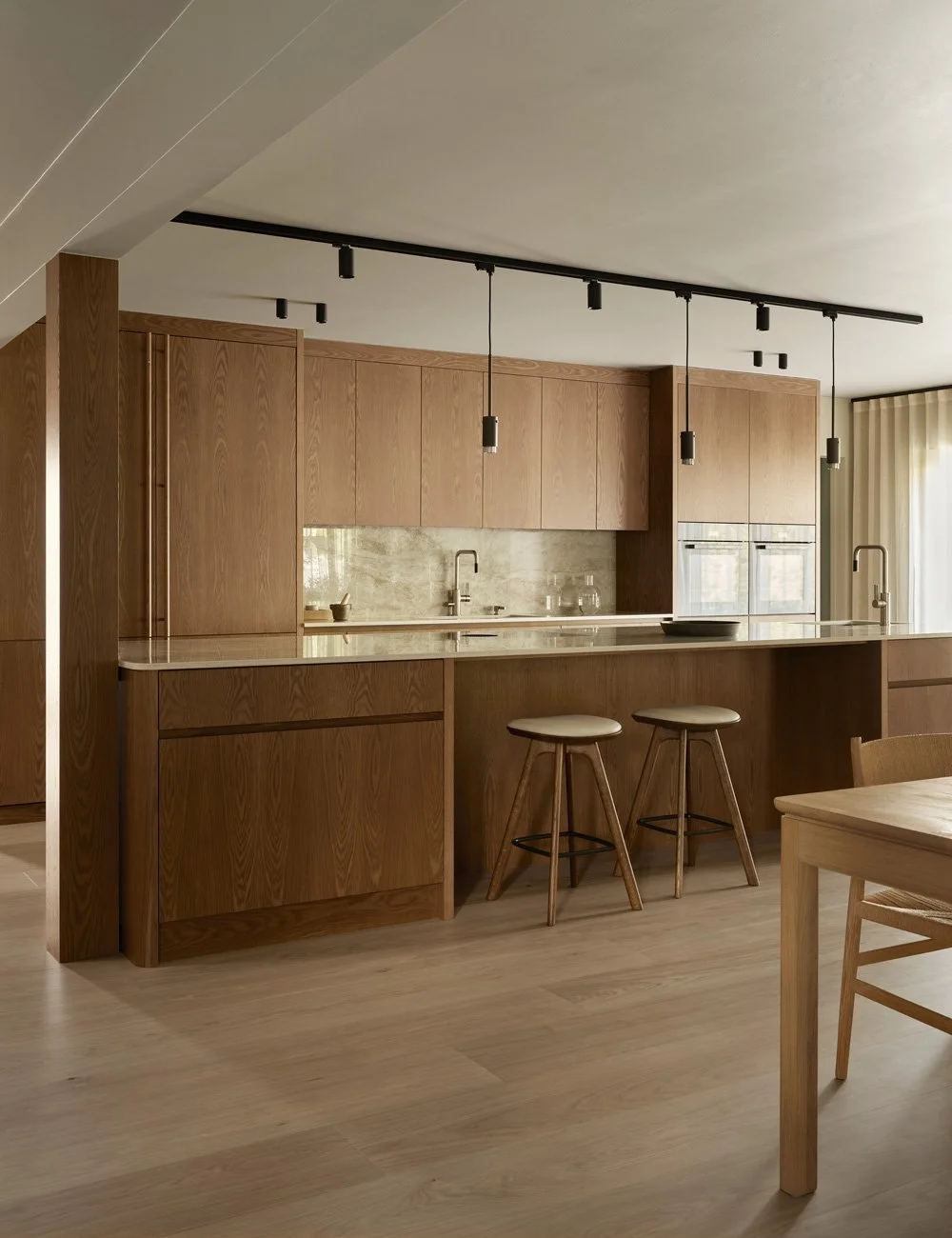
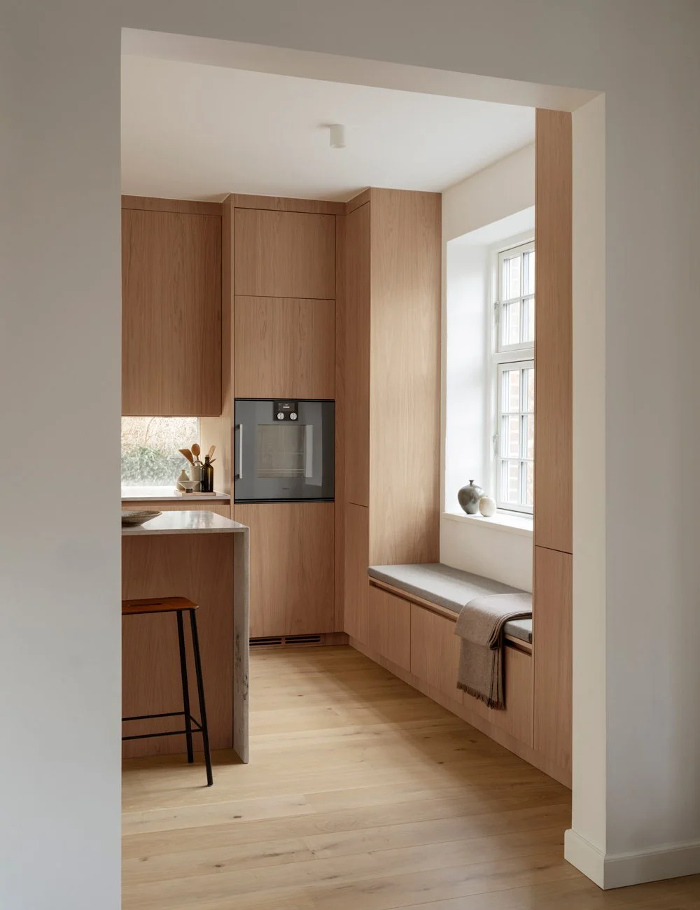
Together with interior designer Alexandra Ogonowski, we’ve created a kitchen for PR professional Mira Fröling. A bespoke, handleless kitchen in light oak – crafted to echo the beautiful details of the original flooring and bring a calm, cohesive expression to the space.
See more of our wooden kitchen inspiration.
The extra high worktop gives the kitchen weight and makes it feel luxurious and architecturally designed. In addition to making it extra high, it has also got straight corners.
Instead of letting the tile end at the height of the cabinets, they have let it climb a row extra along the wall. In this way, a balance is created between the different parts of the kitchen.
Love begins with an apartment and ends in a dream kitchen… At least if you ask the PR professional Mira Fröling. When she and her boyfriend Mattias got access to their new apartment, they asked the interior designer Alexandra Ogonowski from AO/JN Interior for help with ideas for a new kitchen.
- Mira and Mattias were very fond of the Scandinavian feng shui kitchen and wanted something similar. But when I first visited their new apartment, my first question was what they were going to do with the floors.
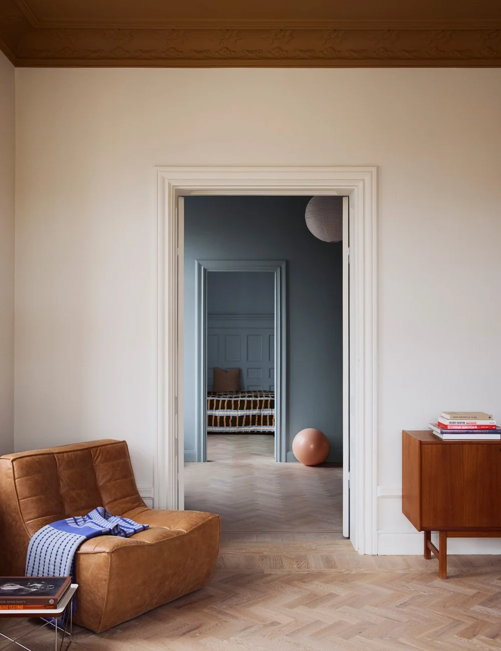
Alexandra managed to persuade Mira and Mattias to lay new because all the rooms had different types of floors. The choice fell on a chevron parquet in warm, light oak.
- Then I thought they would make a kitchen that matched the floor, says Alexandra and thereby explains the choice of doors in warm oak.
The entire kitchen has been painted in a warm beige tone that matches the tile and floor. It is a perfect mix of cozy and minimalist.
With smart choices and well-thought-out details, you can also create a kitchen with small means that has a timeless and elegant design. The harmonious tile and the long, narrow cupboards make this a kitchen you do not get tired of in the first place.
Mira and Mattias had a limited budget and chose to create a kitchen that feels site-built, well-designed and stylish but with a minimalist design. For example, they chose to simplify the project by not moving drains and electricity without letting the new sink end up in the same place as it was before. Another choice was to invest in a bench in stainless steel instead of one in natural stone.
- I had seen several examples of nice worktops in stainless steel so was not difficult to decide, says Mira. The worktop is still in a luxurious look with its extra height and its straight corners.
When we think of stainless steel, we see the rounded sinks and edges in front of us. But by pushing the boundaries of how straight the corners could be, we got a very exclusive expression, says Alexandra. Get inspired by more stainless steel kitchen ideas.
None of the cabinets go all the way up to the ceiling. “Since it is a beautiful old apartment with stucco on the ceiling, it will be much more comfortable to leave the last bit open. It may sound strange but it makes the room feel bigger. In addition, it creates a certain furniture feeling, ”says interior designer Alexandra Ogonowski.
The tall cabinets have frames with recessed handles. It will be a nice contrast to the straight cabinet and bench doors next to it. The light warm tone of the oak was chosen to match the beautiful chevron parquet.
Mira and Mattias are most satisfied with the tiled fan, which almost always receives compliments from guests. By dressing it, you get a well-thought-out and architect-designed impression of the kitchen. In addition, the personal tile gives the kitchen a timeless look.
The doors on overhead cabinets and counter cabinets are minimalist, without a frame. The beautiful grain in the wood is enough to decorate. The tall cabinets closest to the balcony doors, on the other hand, have frames between them. In this way, you create a natural break between the two parts at the same time as it avoids fittings, as there are milled grips in the frames.
Mira and Mattias were happily surprised at how much storage the new kitchen holds. By placing three tall cabinets in a row, you get space with all the major household assistants and other things that you may want to hide.
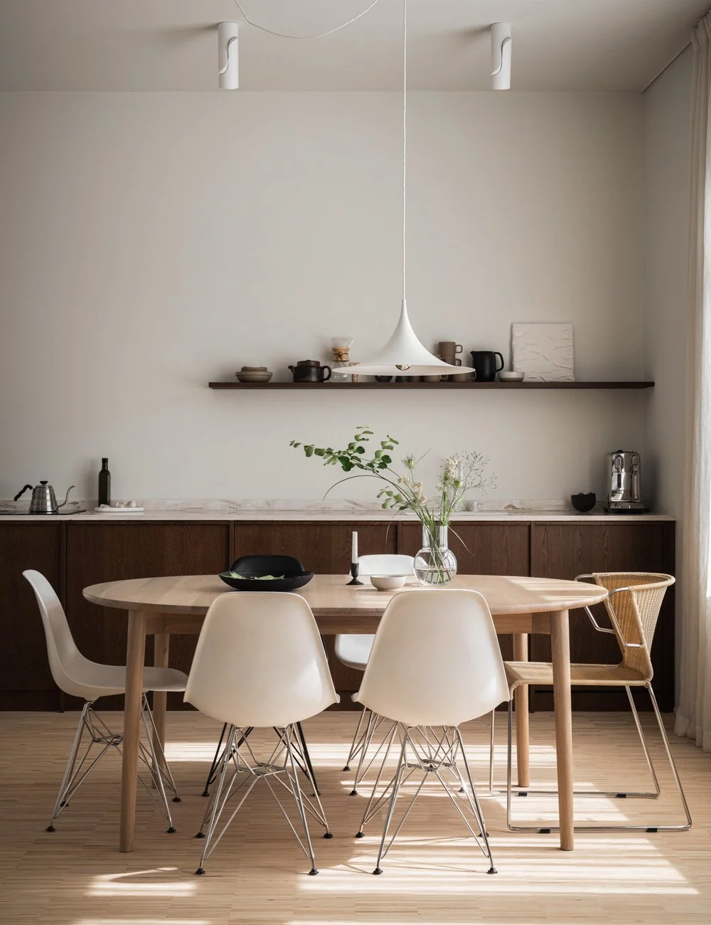
The kitchen also has a dining area with space for guests. Here they have matched up the stainless steel bench with chairs in chrome. The solid table also matches the beautiful tile.
To further create character for the kitchen, a beautiful tile with color changes from tile to tile was chosen, which gives the kitchen a cozy and natural calm that balances the minimalist design. Tiles from Svenska Kakel.
- We are most satisfied with the kitchen fan that was covered with the same tiles as the back splash. That is the first thing people react to when they enter, says Mira.
Alexandra Ogonowski has designed several kitchens in collaboration with us at Nordiska Kök. Discover the popular Scandinavian Feng Shui kitchen and Food Pharmacy's sustainable kitchen.
Photo: Kristofer Johnsson
On our Instagram @nordiskakok you will find all our latest kitchen projects.
On Pinterest, we have created an entire board with all our wooden kitchens, here you will also find the latest inspiration for wall paint, faucets, tables and chairs. See more at Nordiska Kök’s Pinterest.


