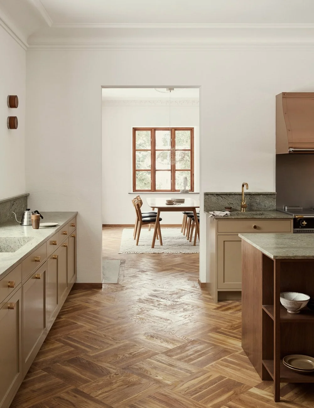
The modern classic Terrazzo kitchen
As a mixture between the modern and the classic, but with a calm and elegant charm, you could describe our latest project in the apartment in central Stockholm. Tailored to the family's wishes and style, but which at the same time feels like an updated version of the kitchen that was probably there from the beginning when the house was built.
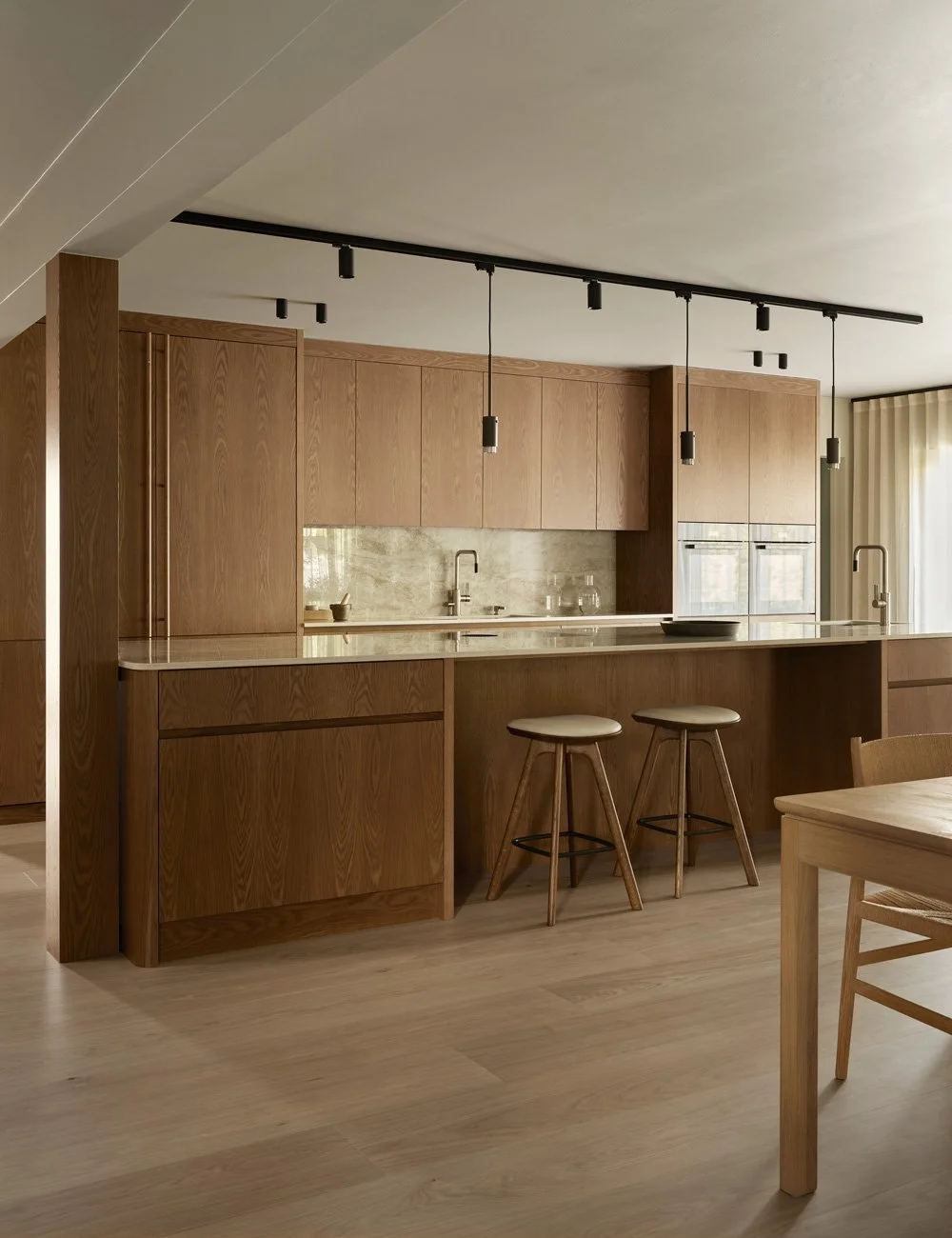
The beautiful floors and chest panel gossip about the age of the house. The frame doors and sliding doors with lined glass match nicely and give an updated and modern touch to the kitchen. Bar stools from Massproduction.
The kitchen belongs to the interior designer Gabriella Gulberg, who a year ago moved home to Sweden after 21 years in London, where she worked at an architectural firm. In connection with the move, she and her husband bought a 158 sqm apartment that has been unrenovated since the 1980s. With her experience, Gabriella has taken over the entire floor and everything has been renovated and adapted to the family's needs.
When it came to the kitchen, we together carved out a well-thought-out, personal and expressive kitchen. For Gabriella and the family, it was important that the kitchen should fit the building and not feel too modern, while at the same time it should not feel too classic either, but be in line with their own style.
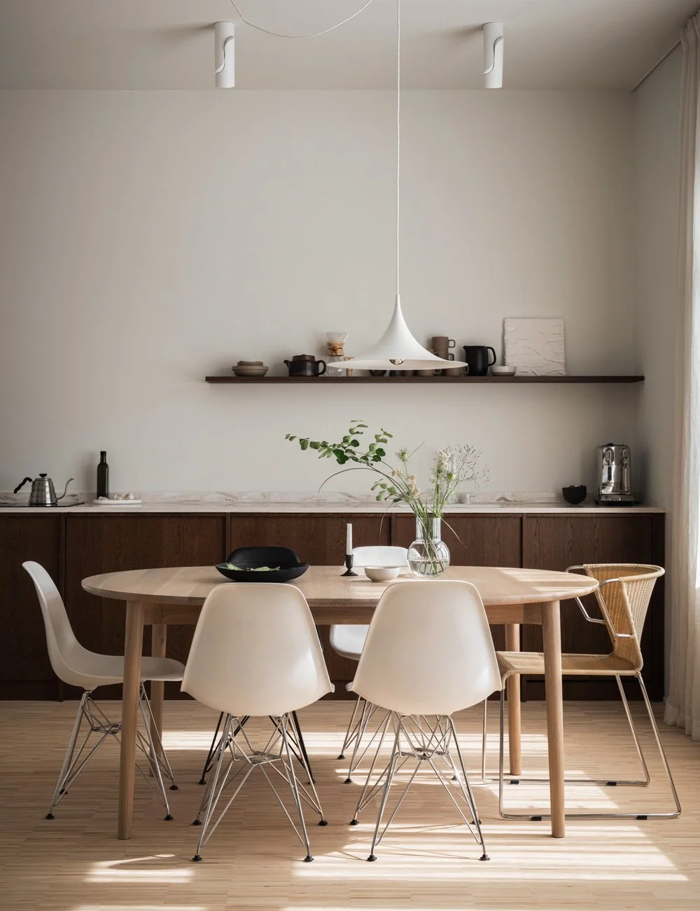
The choice landed on a frame kitchen with minimalist doors but with brass handles for a more classic touch. The kitchen was painted in a warm beige tone that fits perfectly with the Terrazzo, which has been able to control several of the color choices in the kitchen. The walls are creamy white, the floor an oak parquet that have been sanded and oiled in a walnut tone.
The multicolored terrazzo is vibrant and just right eye-catching. It set the tone for the rest of the kitchen, including the brass handles and the beige tone on the doors.
In the opposite part of the kitchen, Gabriella have chosen to place high cabinets where storage, fridge and freezer can be found. You also have a hidden coffee cabinet with pocket doors that are clad in ash on the inside with drawers in solid ash.
Along one wall of the room is a row of top and bottom cabinets that house necessary functions such as stove and sink. The upper cabinets have sliding doors with lined glass, a modern version of the classic display cabinet. Below, you find pull-out drawers and cabinet doors with brass handles. The choice fell on minimalist frame doors to give the kitchen both a classic and modern look. Across from the row of benches is the terrazzo-clad kitchen island that serves as a hub in the home.
The family wanted a kitchen that suited the house but still did not feel too old-fashioned. Instead, they have made a modern version of a classic kitchen. Details such as handles and line glass give a classic feel, but here in a more modern expression.
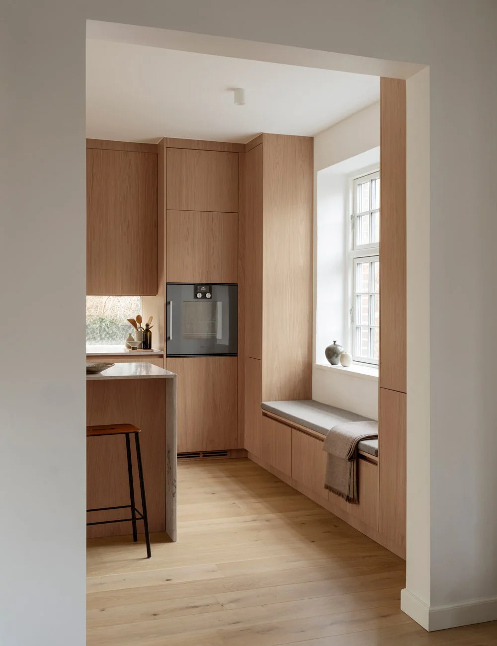
In the hall there is drawers and cabinets that are made in the same style as the kitchen. This way you lengthen the room and make it feel bigger. The asymmetrical cabinets give the room character and add playfulness and creativity to the otherwise stylish expression. The open shelves are covered in ash.
The cabinet will be like a modern version of the serving aisle of that time. This solution makes the kitchen feel bigger and allows the hall to become part of the kitchen.
Opposite the row of benches is a terrazzo-clad kitchen island with seating. Here the family can gather and socialize.
Together with Gabriella, Nordiska Kök's designers came up with a kitchen design where all the family's wishes could be accommodated. Sliding doors, Terrazzo, coffee cabinets, kitchen island - everything is in this lovely kitchen. It is a successful mix between the very personal and modern and the timeless and classic. Although the kitchen is built to suit the family's private taste and lifestyle, the details and the various kitchen bodies have been planned with such precision that the kitchen will feel inviting, aesthetic and personal - regardless of the prevailing trend.
Styling: Caroline Sandström Photo: Osman Tahir
On our Instagram @nordiskakok you will find all our latest kitchen projects. Link here
On Pinterest, we have created an entire board with all our wooden kitchens, here you will also find the latest inspiration for wall paint, faucets, tables and chairs! Link here
Here you can find more interior projects by Gabriella Gullberg.


