Emma Bernhard's minimalist home
The artist Emma Bernhard has together with us at Nordiska Kök created a stylish, minimalist frame kitchen for her architect home in Torekov.
If you have any knowledge of the contemporary Swedish art scene or the latest interior design trends, you have probably heard the name Emma Bernhard. Emma's large paintings on textiles have created a desire for her art. She has also become Sweden's interior design elite's favorite artist, for example, her work has been seen at the home of stylist queen Lotta Agaton and star architect Andreas Martin Löf.
Emma Bernhard touches the spectators with her emotional and clear brushstrokes or stripped-down sculptures. Today she lives in Torekov on the Bjäre Peninsula. She has said that she loves the place of silence, the accessible nature and the barren landscape. There she can create without being interrupted.
Matching the black kitchen with sink, faucet, electrical outlet and window frame in the same color reinforces the well-thought-out and conceptual impression.
The bespoke bench is a perfect place to sit with a glass of wine or a cup of tea and talk to the chef of the evening.
On a beautiful natural plot, Emma and her partner Jarl have had a house built and together with us at Nordiska kök, Emma has designed a minimalist dream kitchen that has a similar wow effect as her art to interior design enthusiasts.
The kitchen has three sections - a row of benches in front of a window and parallel to it a kitchen island with seating and a row of tall cabinets at a ninety degree angle from these two. This combination of three bodies can perhaps be drawn as a parallel to Bernhard's art, where she likes to work within the framework of three repetitions, whether it is three components in her sculptures or three steps in her paintings.
“There is something very sad in Bjare’s landscape that suits me because I am very sad. The landscape feels tormented, unforgiving but beautiful. I like Bjäre because it is not so flattering”
There is plenty of space to move between the three bodies in the kitchen. Here, many get a place at the same time, but the place attracts as much to quiet contemplation over a cup of coffee as to social gatherings.
The new kitchen is completely in black with a matte granite worktop and doors in solid black MDF. Details such as the sink, faucet, hob and electrical outlet are also in black, which creates a uniform, well-thought-out and tight impression. In addition, everything is done with great elegance - the sinks are mounted under a soft rounding in the stone, between the valchromate doors there is a beautiful matte black frame and the various components are largely equal in size, which creates a soothing impression - just like the beautiful balance seen in Emma's works of art.
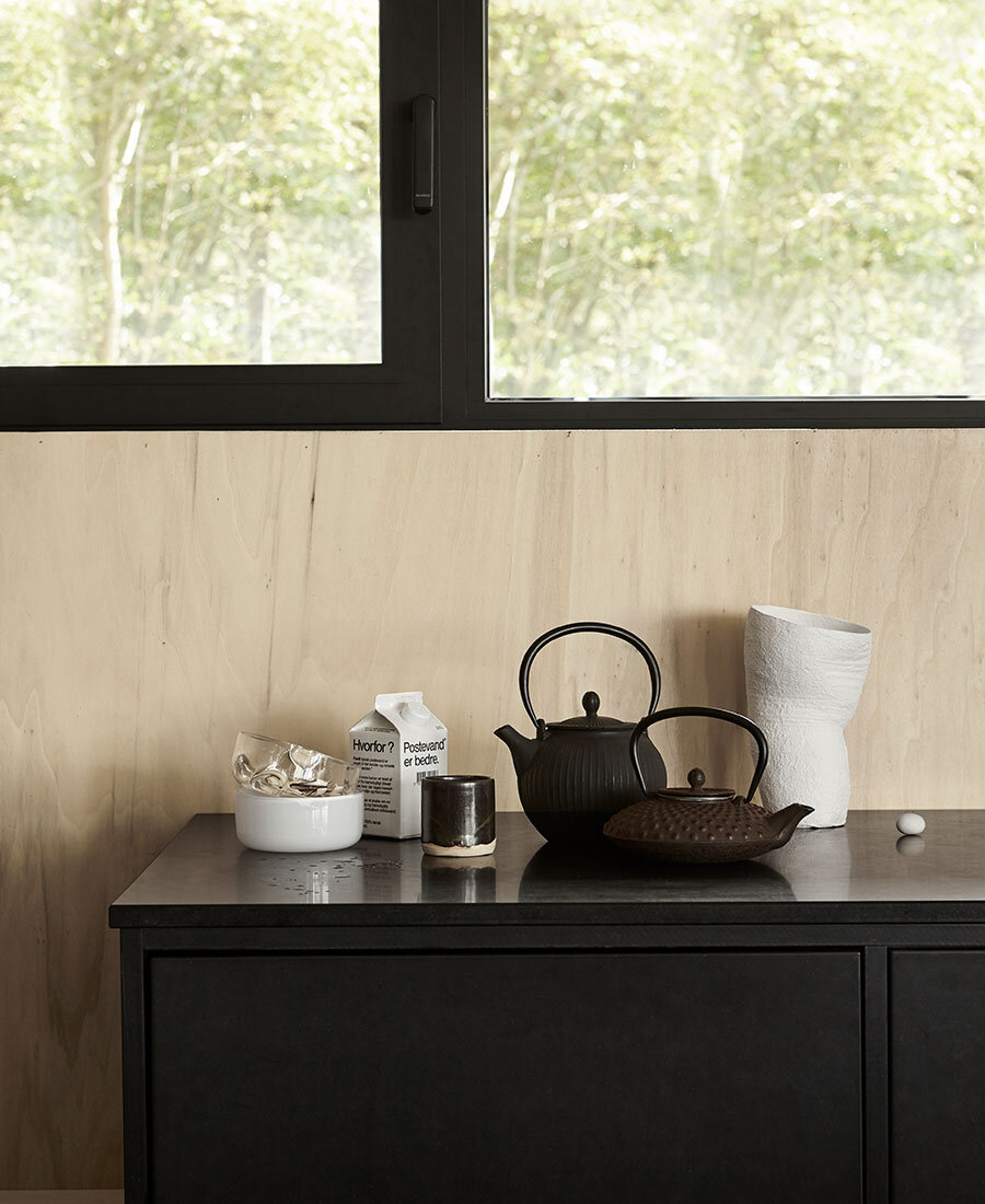
The floor is in polished concrete and becomes a nice background against the soft organic shapes in the grain of the wood on the walls. Beige porcelain by Kajsa Cramer, dish from Västergården, brown urn with handle by Birgitta Jannesson. Cutting board and wooden cutlery from Serax.
The kitchen harmonizes with the rest of the house which is very conceptual and balanced in its design. The uniqueness in Emma's art can also be recognized in the home.
The whole room is very clear, straight and sharp in a way that strangely enough feels both soft and inviting at the same time. It is probably the natural and warmth in the wood that so nicely softens the black details. The floor is in polished concrete and will be a perfect base for these two. In addition, it connects the kitchen with the rest of the house, which is also done in a flawless executed minimalism. The window frame around the window above the sink is matte black and helps to connect the kitchen with the house. This austere, well-thought-out design makes the home and kitchen a beautiful frame that allows the beautiful nature outside to take its well-deserved place. It is almost like a gallery that shows nature as the work of art it is in the large windows. In addition, the landscape has been allowed to enter through the walls in pine plywood.
At first glance, it may feel that the shape has controlled the design of the kitchen completely, but the fact is that it is very practically designed and all the features you could want from a modern kitchen are spread out in a smart and thoughtful way.
The matte granite top matches perfectly with the black window frame and the chrome. They stand in clear contrast to the warm wooden boards on the wall in the architectural room.
In the tall cabinets you get space with both fridge, freezer, kitchen appliances and pantry. In addition, there is room for everything else a minimalist might want to hide.
Both benches each have a sink and faucet, a smart luxury detail that more and more people planning kitchens are starting to request. Among other things, they prevent you from being in each other's way when there are several people in the kitchen at the same time. The large tall cabinets hide everything that can steal focus and make you feel calm and grounded when you are in the kitchen. A smart trick for those who have space and who want a home with a calming effect.
Nordiska kök and Emma Bernhard have simply created a kitchen that is functional, versatile and timeless and that fits perfectly into Emma's house and life in the middle of Torekov's fantastic nature.
Styling: SundlingKickén Photo: Osman Tahir
On our Instagram @nordiskakok you will find all our latest kitchen projects.
On our Pinterest we have created an entire board with all our kitchens, here you will also find the latest inspiration for wall paint, interior, tables and chairs!


