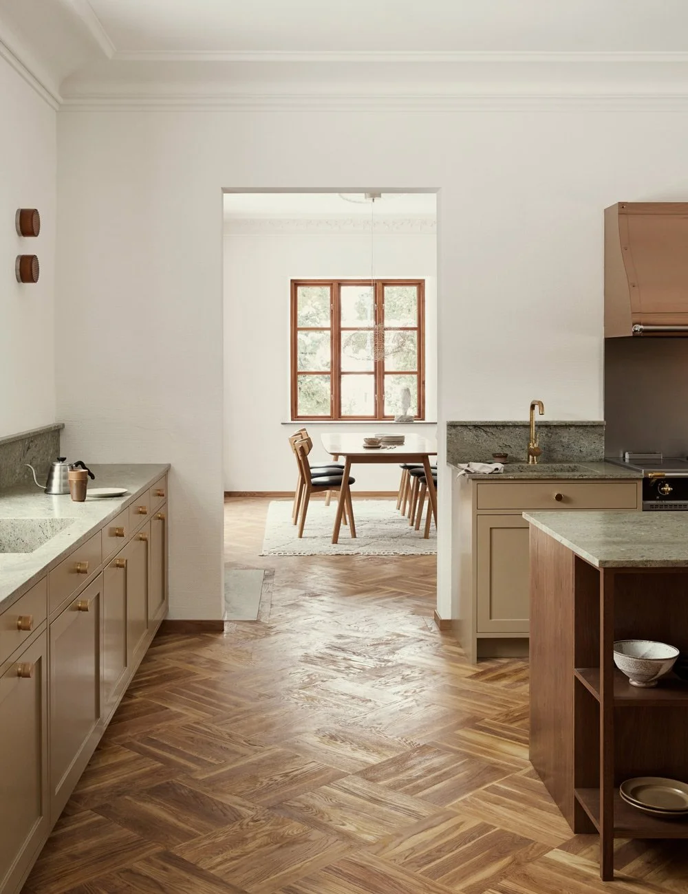
The Nordic Light kitchen
Helene Richter and her boyfriend Aleks live in an apartment in central Malmö. They gained access to their new apartment at the beginning of the year and have already had time to renovate and build a new kitchen. It was obvious from the beginning that the couple wanted to move the kitchen from the small room it was located in to one of the large living rooms in the apartment. The dream was a social room with space for a large dining table and enough storage to house Helene's growing collection of ceramics.
See more of our Shaker kitchens.
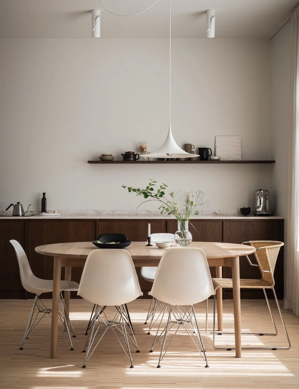
By keeping the color scale and style together, you can choose the width of the door that is most functional without the whole feeling cluttered. The Landala table has been designed by Emma Olbers and the chairs Pinnstol come from Helene's family company Norrgavel.
Having extra wide drawers is very practical, says Helene. Just such a thing as that you get space with several different containers to sort garbage in, and an extra wide sink above. Perfect when you want to wash plates and large pots. The kitchen is painted in a light shade and is matched by the wall color Jotuns Sans. Faucet from Primy.
The house in which the apartment is located dates from 1907 and the couple wanted a kitchen that matched the architecture without feeling old-fashioned for that matter. In addition, they wanted the kitchen to appeal to more than themselves. For environmental reasons, they wanted a timeless kitchen so that future owners do not want to tear out the kitchen when they take over.
The generous display cabinet houses Helene Richter's collection of porcelain and glass. The fittings, as well as the beautiful stick chairs in birch, come from the family business Norrgavel, which was started by her father. Building a larger display cabinet is perfect for those who like to have dinner and have a larger collection of crockery and glassware. Get inspired by display cabinets in the kitchen.
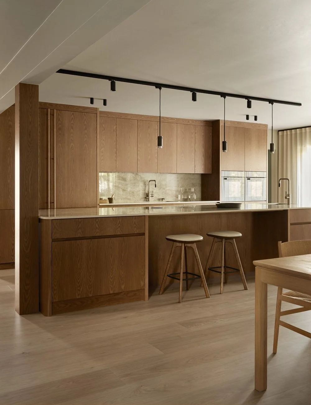
Fridge and freezer are hidden behind the beautiful Shaker doors. There is also a cabinet above the fridge for the kitchen appliances that are used less often. Knob strip and stool from Norrgavel.
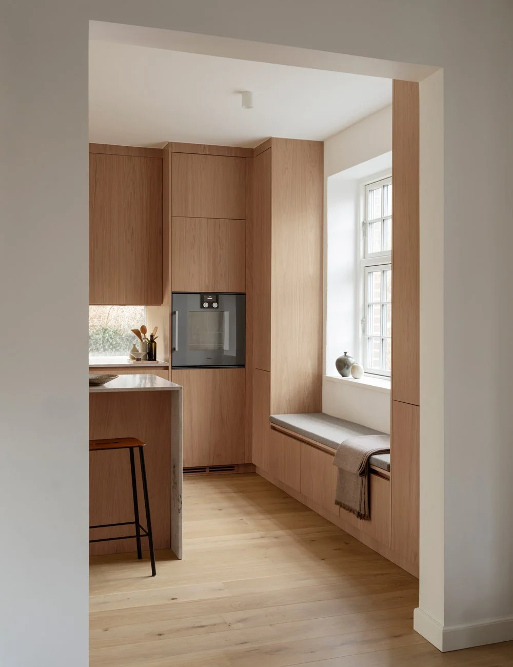
The choice therefore fell on a modern Shaker kitchen with Jura limestone.
- I am restrictive when it comes to the use of stone in general, but wanted a light and warm color on the bench and preferably a feeling of nature. That's why we went and looked at most types of stone and fell for the Jura, Helene explains.
If the stone has defects over time, it does not matter to her, she welcomes patina.
Above the stove is a fan that is clad and painted in the same color as the wall (Jotun Sans). The Jura limestone matches perfectly with the modern shaker doors and the white oiled oak floor.
By having the display cabinet on one side, the kitchen counter on the other and the dining table in the middle, the room has been given a better balance and feels more inviting. By building a cabinet with the same depth as a wall cabinet, and letting it go from the floor up to the height of the door lining next to it, you get a feeling of a classic serving cabinet or a free-standing display cabinet.
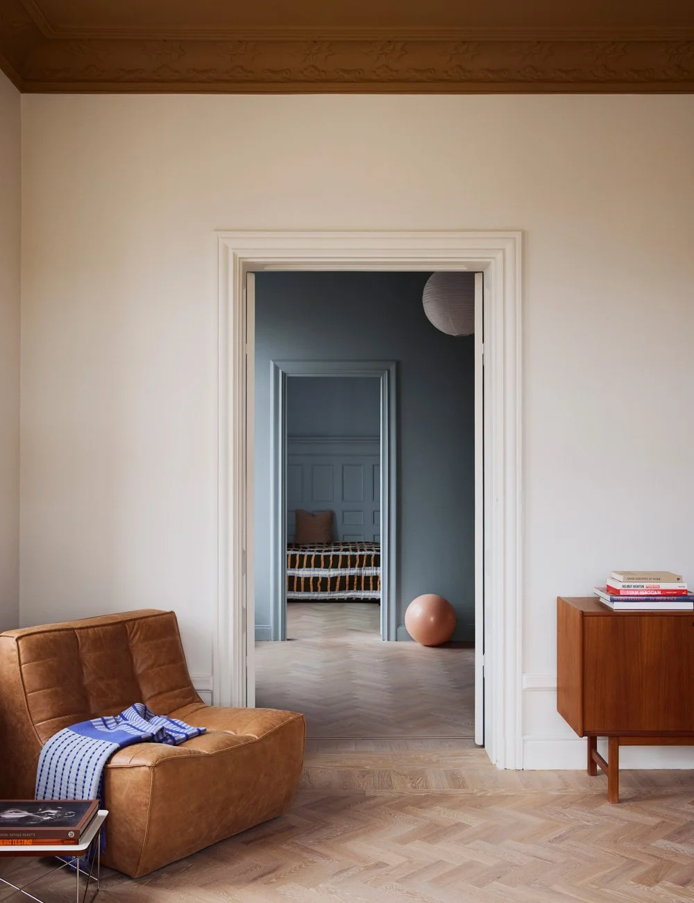
The airy room has two entrances: one from the hall and one from the living room - perfect when you want the kitchen as the home's social and functional center. From the hall towards the kitchen there is a beautiful row of skylights. To get them to catch the eye, they were painted in white and the kitchen in a light, beige color. The beautiful Art Nouveau stucco also appears against the beige walls, which are in a slightly lighter color than the kitchen doors. These light and warm variants of beige fit perfectly with the floors in white oiled oak and the beautiful limestone.
Instead of wall cabinets, a discreet shelf with recessed light was placed above the sink. It gives the room air and peace. From the beginning, the pair were hungry for knob handles, but since several of the drawers and doors are extra wide, a slightly more grip-friendly handle was chosen.
The inside of the drawers are in solid white pigmented oak. It makes the whole kitchen feel more elegant and more solid. In the drawers you can, for example, store silver cutlery, napkins and candles. Or like here - all the finest wooden tools.
Along one of the walls there is a kitchen counter with all the kitchen functions: dishwasher, sink, storage, stove, oven, fan, fridge and freezer. Since the kitchen was moved from another room, and new pipes had to be drawn along the wall, the kitchen counter is 10 cm deeper than standard. Above the kitchen counter is a small shelf with recessed light and a fan cover. Both have been painted in the same color as the wall - a smart way to increase the feeling of space. On the opposite side of the room there is a pantry on one side the door to the living room and a display cabinet on the other side.
The inside of the cabinet is clad with white pigmented oak that fits perfectly with the white oiled oak parquet on the floor. There is room for all your favorite crockery and glass.
In the apartment's other rooms there are both oak and pine floors, to keep the impression together, Helene and Aleks chose to whitewash the oak parquet. The site-built pine shelf in the living room also matches perfectly with the bright kitchen.
Stone slabs go well with fully painted kitchens, they give the otherwise very calm and harmonious kitchen life with their organic veins and exciting color changes.
On our Instagram @nordiskakok you will find all our latest kitchen projects.
On Pinterest, we have created an entire board with all our wooden kitchens, here you will also find the latest inspiration for wall paint, faucets, tables and chairs!
Nordiska Kök Pinterest
Photo: Andrea Papini
Styling: Marie Graunbøl
Text: Michelle Meadows
About the writer
Michelle Meadows has over 15 years of experience as a journalist and writer, specializing in design, interiors, and lifestyle. She has worked as an editor at Residence Magazine and contributed to several leading Swedish publications in the fields of lifestyle, fashion, and interior design—including Elle and Elle Decoration.


