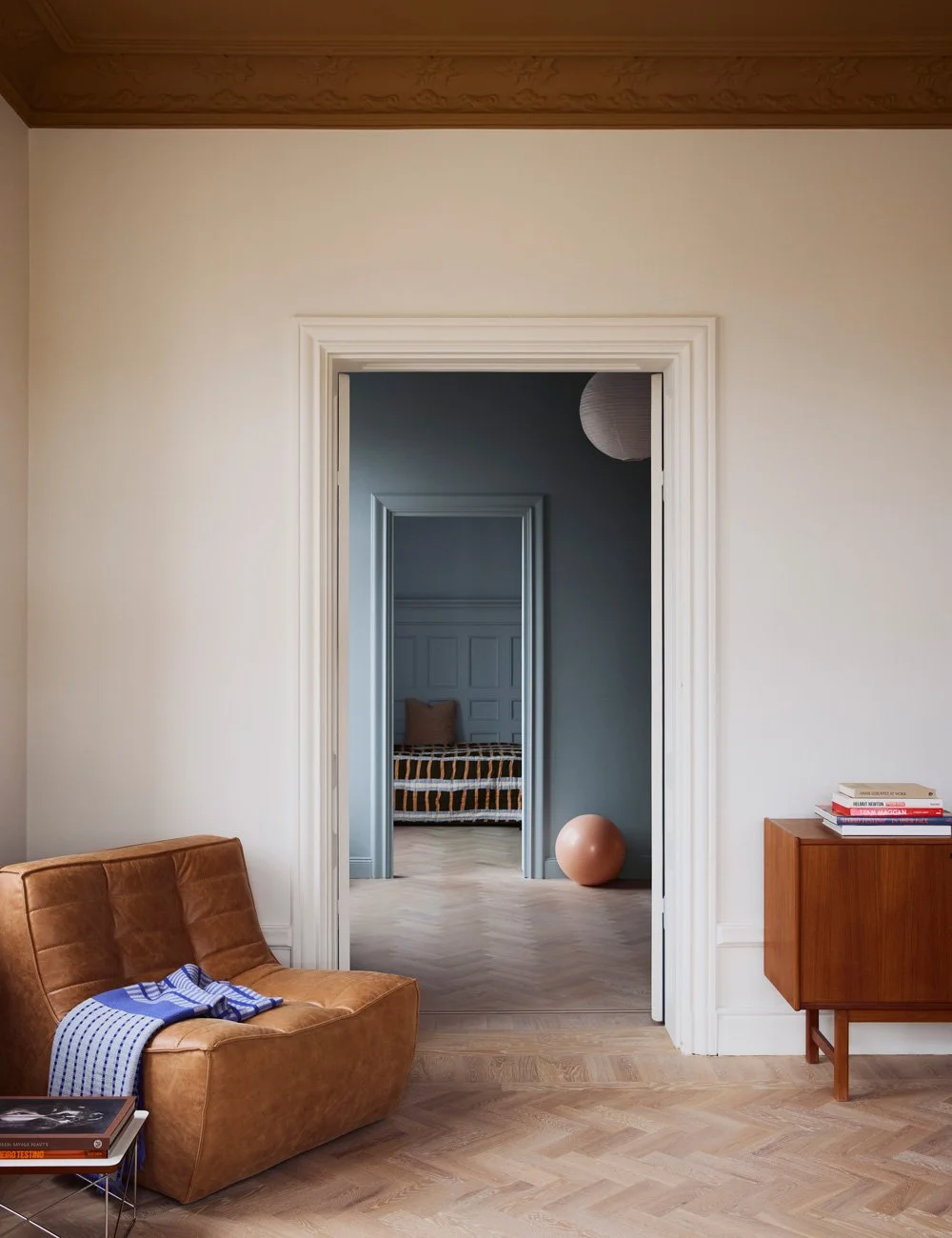
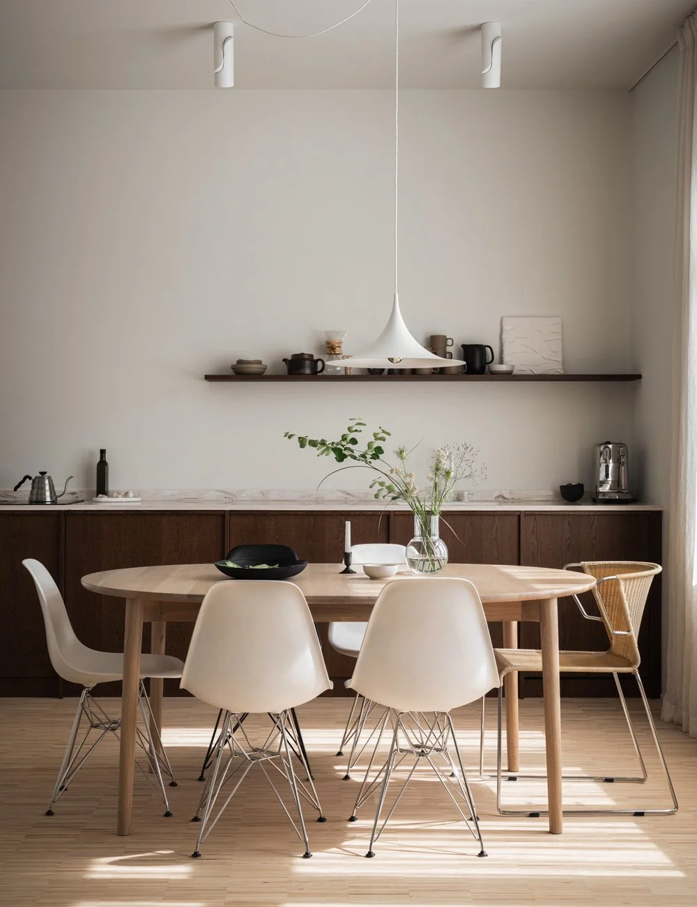
Interior designer Daniella Witte's home
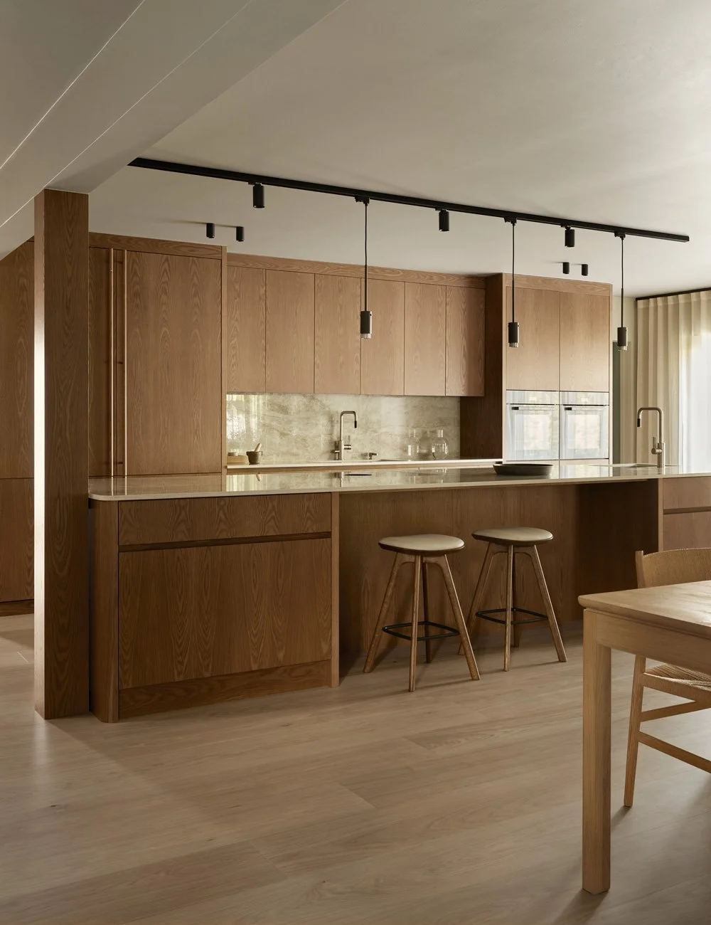
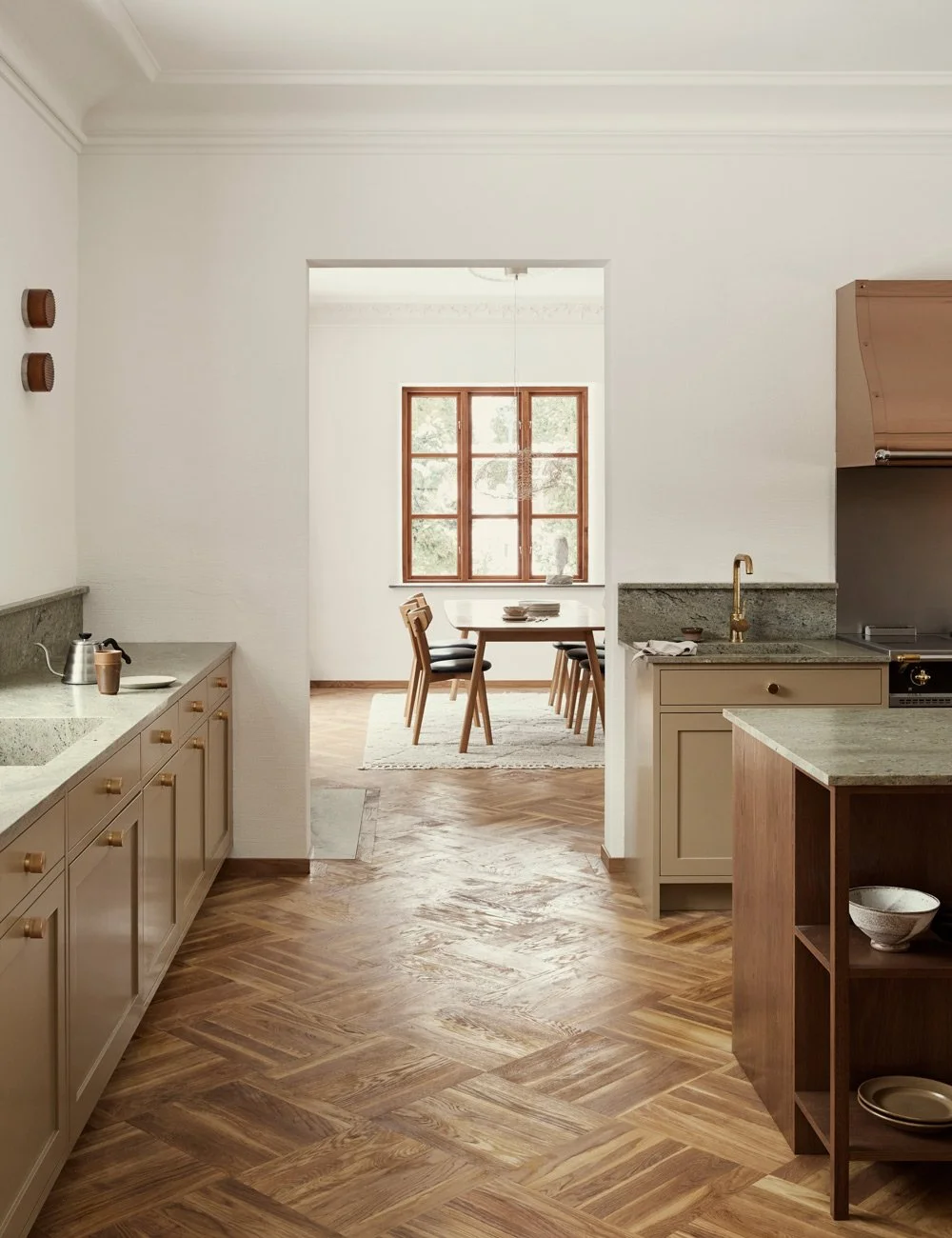
Together with the interior stylist and influencer Daniella Witte, we have designed a stylish kitchen with a well-thought-out floor plan and inviting design. The powdery, warm tones make the kitchen feel cozy and soft despite its stripped-down design.
For more than a decade, she has inspired with her soft, stripped-down and natural interiors via her blog and Instagram account. She is one of our most influential stylists and has a unique ability to create environments that make the viewer relax and feel grounded.
Photo by Andrea Papini
The kitchen is located between the dining room, living room and patio. Here is everything you need but at the same time nothing unnecessary. The accents in black, such as the handles on the fridge and freezer, create structure in the room.
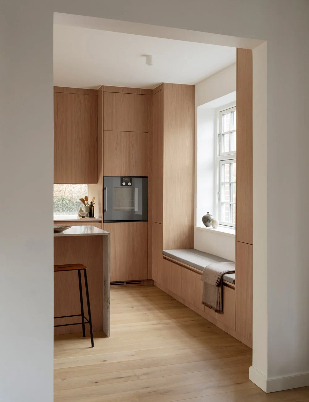
Beautiful bench in warm natural tones, thought through to the smallest detail by Daniella.
From her home in Lomma, Daniella runs her business, which not only involves photographing and styling pictures, but she also draws and decorates homes and runs a studio among other things.
Her inspiration often comes from nature and Daniella often finds her props in her surroundings. Both the house and Daniella's studio are adjacent to your own home and the short geographical distance means that work and leisure often flow together. Therefore, she and her husband Fredrik started a few years ago to look for a holiday home where they could go to relax. Pretty immediately they ran into a wonderful plot in a pine forest with only a few minutes walk to the beach. And that only 50 minutes from their home!
To create the calm, harmonious feeling in the kitchen, the fan has been hidden in one of the top cabinets and the fridge and freezer behind each door, in this way the impression becomes uniform instead of messy. Bar stool from Frama.
Daniella Witte and her husband Fredrik on the patio outside the fantastic Villa Witte. Read more about Daniella Witte and her fine interior design project at www.daniellawitte.se
The kitchen feels inviting and soft despite its hard material. The walls are plastered with c-mortar and the worktop and splash guard are cast in concrete by Betongdesign. The stripes in the splash guard are repeated in the kitchen island and are inspired by the facade.
The area in which the plot is located has a strict detailed plan that limited their house dream both in size and choice of material. But that all surfaces needed to be planned extra carefully was a challenge Daniella and Fredrik gladly took on.
- In the dark winter months, I think it's super fun to sit and draw houses and think of solutions, says Daniella who has designed and built houses together with Fredrik a few times now.
The stainless steel sink is undermounted in the concrete slab and is matched by a chrome mixer from Vola. Just above is a small rectangular window with black frames. The kitchen island also has smart storage underneath.
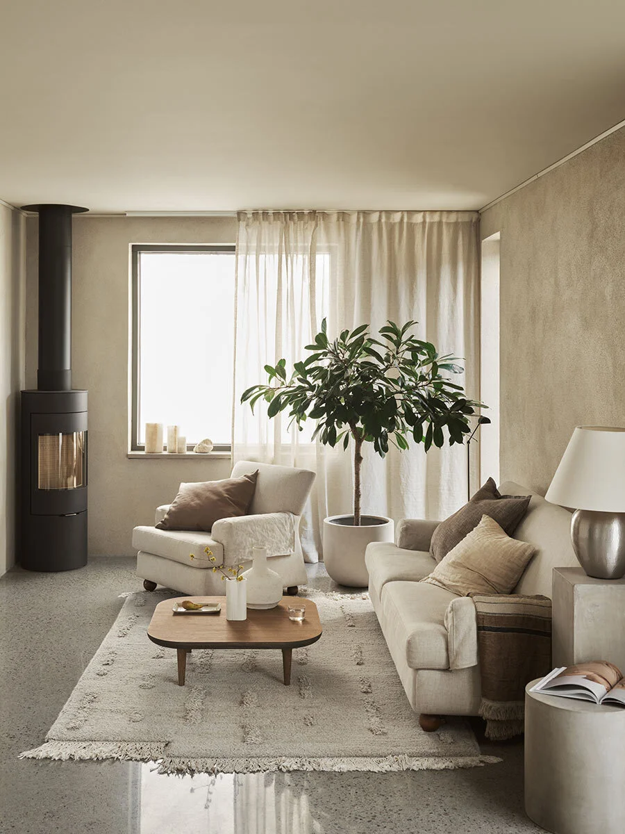
The beautiful living room, decorated by Daniella.
By sticking to straight lines and just a few materials, you create a kitchen that feels bigger than it is. In addition, it gets an airy and inviting feeling. For that reason, clean doors with an invisible grip strip at the top were chosen.
The cozy “readers corner” in the home of Daniella Witte.
The walls are plastered and have a lovely, living structure. Since the plaster has such a tactile feel, Daniella wanted simple, smooth doors without frames and with an invisible grip strip. To still add a surprising element, the insides of the kitchen cabinets are clad in oak.
To match the stripped-down doors and the tactile walls, a countertop in beige concrete was chosen. And to connect the kitchen with the rest of the home, the bench has been matched with a splash guard and a kitchen island in the same light concrete but which is provided with small lines that pick up the feeling of the house's exterior wood paneling.
By sticking to a color scale and only a few materials, you get a kitchen that feels calm and well thought out. If you also choose a color that is powdery and warm, the kitchen will be cozy and soft despite the minimalist design. The kitchen in Villa Witte really feels both natural and vibrant.
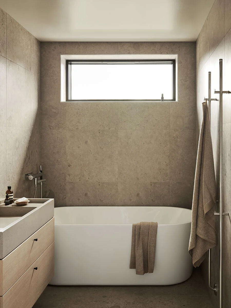
The harmonious bathroom with wood elements and a calm limestone.
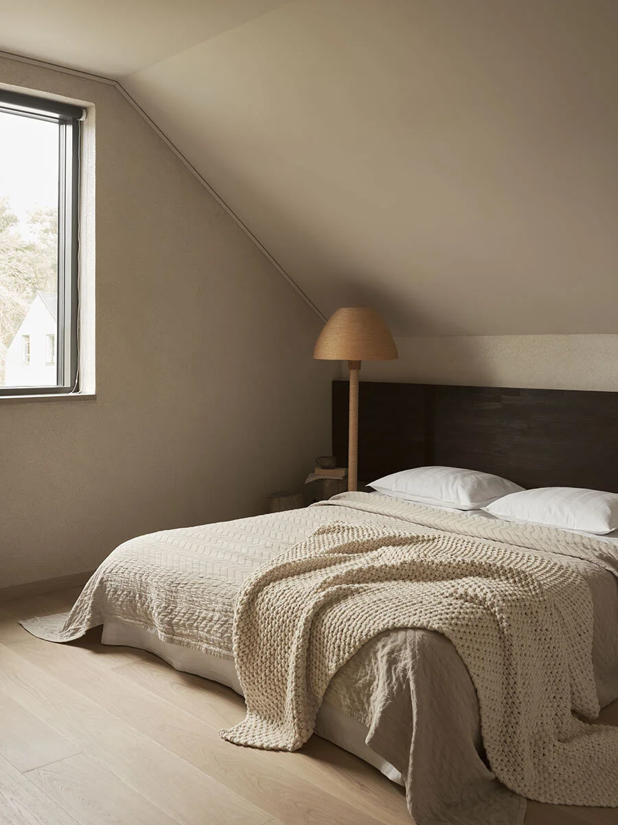
The bedroom, also in warm earthy colors.
Despite its hard materials, the entire kitchen is soft and caring. One of Danielle's wishes was to create a home you come to to breathe and where the choice of materials would be what takes care of and welcomes you - not stuff and plots. Villa Witte is thus a place where you do not decorate in abundance but where the materials speak. With this in mind, you do not need as much crockery and glass and the limited size of the kitchen is thus perfect - even though it is on the smaller scale. A soft and welcoming hub in the home where you can really catch your breath.
Beautiful pot from The straw studio.
Lovely interior design in the Villa Witte, by Daniella Witte.
Photo: Andrea Papini/Sofia Törnqvist
Text: Michelle Meadows
www.daniellawitte.se
About the writer
Michelle Meadows has over 15 years of experience as a journalist and writer, specializing in design, interiors, and lifestyle. She has worked as an editor at Residence Magazine and contributed to several leading Swedish publications in the fields of lifestyle, fashion, and interior design—including Elle and Elle Decoration.
On our Instagram @nordiskakok you will find all our latest kitchen projects,
On Pinterest, we have created an entire board with all our wooden kitchens, here you will also find the latest inspiration for wall paint, faucets, tables and chairs.
Nordiska Kök Pinterest


