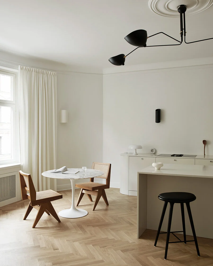
The rounded minimalist kitchen
An apartment from the turn of the last century has been transformed into a stripped-down design dream. Soft colors and rounded corners soften the minimalist and give the kitchen a modern feel.
A dream that probably many with an interest in interior design share is that of finding a home in need of a total makeover. In a large apartment on Östermalm, a family has recently fulfilled the dream and created a home that is well thought out, stylish and that breathes warm minimalism.
The creative idea was that the kitchen would match the other rooms in the very stylishly decorated apartment. Therefore, the same bright color scheme was chosen as in the rest of the home. The round shape of the end of the row of benches is also found in the adjoining rooms.
By mounting the cabinet to the wall and painting it in the same color as the rest of the kitchen, it blends into the background and creates an airy feeling. In addition, it becomes very easy to vacuum and dry the floors. Pall Tabouret Méribel by Charlotte Perriand.
One of the biggest changes in the apartment was to move the kitchen from its hidden place at the far end of the floor. The new kitchen is located in one of the three large rooms that forms the home's social hub. Since it is located next to the living room, and also visible from the TV room, it was a wish from the family that the kitchen should not be experienced as a kitchen, more of an extension of the other living rooms.
The feeling in the floor is modern minimalist and all rooms are painted in a warm, light tone. Although there are many classic details, such as stucco and profiled door linings, everything blends together because they are painted in the same color.
Much of life takes place in the kitchen. Everyone gathers here several times a day and much of the weekly puzzle is planned here.
To match the family's wishes, a kitchen was created without upper cabinets but with a large social kitchen island. To further enhance the requested furniture feel, both sides of the kitchen counter are ending with round shape. The shape connects the kitchen with the rest of the floor - the sofa in the living room has, for example, a matching round design and in the hall there is a large arch. In addition, the rounding gives you that subtle feeling of personality and design.
The entire kitchen interior is painted in the same creamy white tone as the walls and just like in the living room, it is contrasted by accents in black, such as the large Serge Mouille lamp in the ceiling and the wall lamps above the kitchen counter.
Two sliding doors separate the kitchen from the living room. Since you look straight into the kitchen, it was a wish that the kitchen would not look like a classic kitchen but more a living room.
The hob has a built-in fan to avoid a large cover on the wall. The kitchen is matched by Eero Saarinen's Tulip Table and Capitol Complex Chair from Cassina.
On one wall of the kitchen island there is a row of tall cabinets. There is a double set of fridge and freezer, an oven and a combined oven and microwave. In addition, there is a wine cooler from Gaggenau where the glass door is clad in the same color as the remaining cabinets. The wine cooler gives the room a touch of life and elegance and invites to late dinners. By hiding the other appliances such as the fridge, freezer and dishwasher and just letting the wine cooler take place and be seen, the minimalist feeling is further enhanced and gives weight to what is actually visible.
The entire floor was completely renovated in 2020 and has been given a minimalist style but with details that gossip that the house is over 100 years old. To soften the minimalist home, a warm tone of white was chosen for the walls and kitchen, curtains around the windows and rounded shapes in several of the rooms.
By rounding the corners of the kitchen counter, the row of benches feels more like a sideboard than a classic kitchen. The minimalist kitchen fits, despite its restrained design, very well into the house which is from 1910.
From the kitchen you have an overview of the other two living rooms and it is an obvious place to gather - especially with the social kitchen island in the middle.
Photo: Kristofer Johnsson Styling: Caroline Sandström
On our Instagram @nordiskakok you will find all our latest modern kitchen projects. Länk här
On Pinterest, we have created an entire board with all our minimalist Scandinavian kitchens, here you will also find the latest inspiration for wall paint, faucets, tables and chairs! Länk här


