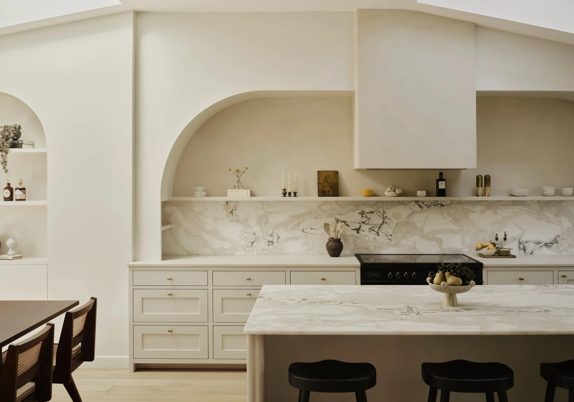
Scandinavian feng shui kitchen
In an apartment in central Stockholm, we have together with interior designer Alexandra Ogonowski created a kitchen where the modern Scandinavian meets the traditional Asian, with a harmonious balance of colors, shapes and materials.
See more of our Shaker kitchens here.
The kitchen was planned in such a way that the family could sit comfortably around the kitchen island. By making the kitchen island in two different levels, you can avoid uncomfortable bar stools.
The interior designer and stylist Alexandra Ogonowski, whose hallmark is elegant homes in powdery tones with a soft twist, likes to decorate a home with elegant Italian and Danish furniture but then adds personal accessories such as Japanese urns or fluffy mohair rugs.
Alexandra's inspiration often comes from other cultures and that gives her Scandinavian interior the little extra that is needed to make it feel unique. She herself justifies her style by saying that a small bohemian lives within her.
Which does not mean that I like it when it is messy or cluttered, but for me it means that I love the combination of old and new and exciting things from other cultures.
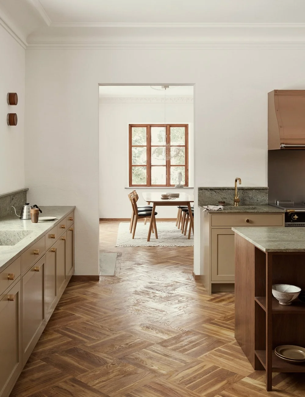
Because of the size of the room, we made the lower cabinets extra deep. Instead of the Swedish standard measurement of 60 cm, they are now 80 cm. By using a back splash in the same stone, you get a very luxurious impression.
The kitchen is in an open floor plan, connecting the living room and dining area. The cabinets are different widths so that all lines in the kitchen will align in the best way and feel restful to the eye.
This project is in an apartment in downtown Stockholm where the customer wanted a large social kitchen that is connecting the dining room and living room in the open floor plan. The result is classically Scandinavian with clear influences from the Asian. When you look at the meeting between the warm wood, the straight lines in the framework, the elegant handles and the structured curtains around the window, it is in the meeting that the magic happens.
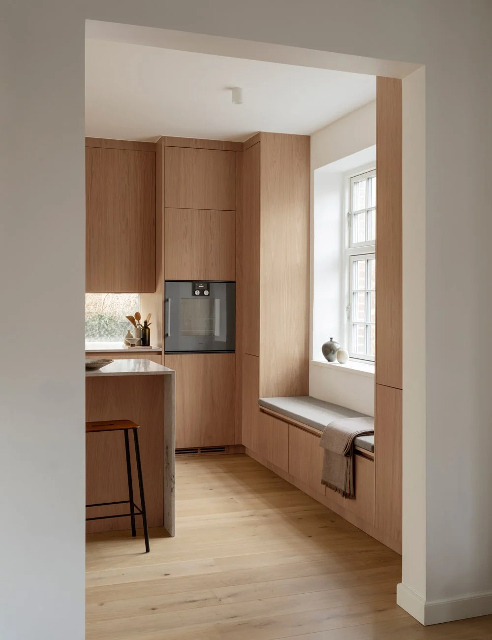
The base cabinets in stained oak have no frames or other "unnecessary". The soft, warm veins in the wood are more than enough. Because the kitchen is so large, we have chosen to be generous in proportions and all cabinets are extra deep.
Discover more of our bespoke wooden kitchens here.
A large kitchen for those who love to cook and a kitchen island to let life happen around. In this newly built kitchen, the kitchen island plays a central role. It is inspired by Japanese teppanyaki hobs where the chef entertains the guests with his cooking.
The 80 cm deep cabinets meet a warm beige Jura limestone. The limestone has also been allowed to climb up along the walls as an exclusive back splash. The combination of oak and limestone brings to mind Japanese interiors where materiality is everything and the beauty of nature meets the geometric and carefully restrained.
Above the back splash, on the other hand, you get a different but inspiring feeling. Here the doors have tighter frames and are painted in a cool beige tone. Where the lower part felt Japanese and natural, the upper part feels like a stripped-down Scandinavian take on the classic Shaker kitchen. Together they breathe history and romance.
The small shelf is built in Jura limestone and in order to be able to support the heavy stone, consoles were specially designed in the same material. Pots from the Artillery.
All choices are carefully thought out, for example, the herringbone parquet has the same tone as the doors on the cabinets and the walls have been painted in the same color as the top cabinets. Tap, oven, hob and handles are all silver colored.
The overall impression of the upper and lower cabinets is a flirt with the Japanese and the French but executed in a Scandinavian way. By tweaking a few small details, you can get a feeling without floating away too much.
In addition to the adapted depth of the base cabinets, the sections are also different in width, the reason is that everything should line up and the eye should think that everything is the same size.
That's the thing, to adapt those small details and get the best result. The most difficult thing was to get the different notes to play with each other. The floor, the walls, the room, the top cabinet and base cabinet. Everything would be one and the balance in the tones just right.
It is in the material mix the magic happens. The fully lacquered doors, the shiny chrome, the organic limestone and the grain in the wood. Together, they bring out each other's best sides.
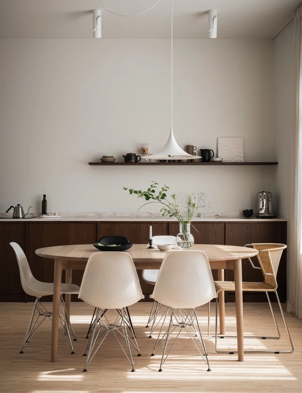
This is a kitchen for someone who loves to cook, who likes to spend hours preparing and who holds fantastic home dinners. Level differences mean that you avoid the classic bar stools. Instead, there are three chairs that were found at the auction house Lauritz and that have been renovated and given new cushions.
A large part of my work is about finding the right furniture. Instead of just buying design classics, I try to find old furniture with beautiful shapes that give the home that personal touch, says Alexandra.
The stove flows seamlessly into the Jura limestone and you can barely see it. To give the room more air and a more balanced impression, a bench fan has been chosen instead of a classic fan cover. The oven is hidden in the kitchen island.
The inspiration comes from Japanese teppanyaki hobs where hungry people gather around the chef and watch the show. The beautiful lamp from Parachilna hangs above the works top and feels like an updated and more exclusive version of a Chinese lantern.
The stove is on the left side of the kitchen, with a counter fan in the middle of the hob. Above the stove is a floating shelf in the same limestone as the worktop. When the stone was so heavy, brackets were specially designed in the same material.
Even if you can recognize my style and Nordic kitchen style in a project like this, it is precisely those special tweaked details that give the kitchen its identity, concludes Alexandra.
See price for our site-built kitchens
Photo: Erik Lefvander
Styling: Alexandra Ogonowski, also founder of her own brand Pihl Strehl.
On our Instagram @nordiskakok you will find all our latest kitchen projects.
On Pinterest we have created a whole board with all our wooden kitchens, here you will also find the latest interior design, inspiration for wall paint, architecture, tables and chairs!


