The Lotta Agaton Gallery kitchen
Few people have influenced how Swedes decorate their homes more than stylist and interior designer Lotta Agaton. How she has furnished her home and office over the years has been a clear indicator of the trends to come. Together, we have designed a minimalist kitchen with Lotta and her team, for the recently opened Lotta Agaton Gallery in Stockholm.
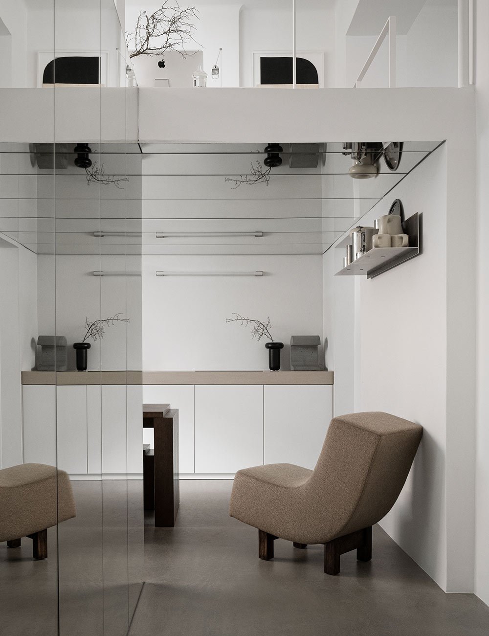
Minimalist, white cabinets with a beautiful grey worktop in Scarpa Marble. The mirrors in the ceiling creates an optical illusion and make the room feel more spacious than it actually is.
On the loft, Lotta and her team have their office spaces overlooking the gallery.
– Our idea is to use the space as an office but also as a design gallery where we sell art, accessories and furniture.
The inspiration is partly taken from The Apartment in New York, which was both an office, showroom, and store.
– By decorating the space with everything from furniture to art, we show our customers the importance of the final touch and the small details, says Lotta.
To create a gallery feeling, all the walls have been painted white, the electrical wiring has been hidden, and the floors are in light gray concrete. Additionally, a large, mirrored wall has been built to bring in more light and increase the feeling of space.
The kitchen is located at the back under a loft with the team's workstations. The cabinet doors are white, minimalist, and without handles. Because this is not a residential kitchen, the functionality has been adapted for office life. Discover our minimalist kitchens.
The white kitchen almost becomes a clean canvas, displaying beautiful design elements and art. Get inspired by our white kitchens.
The site-built coffee station in dark stained oak matches the specially designed dining table with accompanying benches. Read our tips on decorating with open storage.
– Storage was crucial. When customers come by the kitchen can’t look cluttered, so everything had to have its place. We are very happy with our cabinet that houses the coffee and tea station, as well as the smart drawers with electricity, where we hide the toaster and similar items.
On the inside, all cabinets and drawers are lined with dark-stained oak to match the beautiful dining furniture designed for the gallery. The oak adds to the minimalist kitchens exclusive and designed feeling. As it is located under the work loft, the ceiling has been covered with mirrors in order to give an optical illusion of space, and also matches the rest of the gallery.
– We won't be frying food here, so mirrors in the kitchen ceiling are no problem in this case, explains Lotta.
The gallery displays a curated collection of art and design objects, all chosen by Lotta and her team.
A gallery, showroom and an office space - all in once at Lotta Agaton Gallery at Karlavägen in Stockholm.
The countertop is made of a special type of marble that architect Carlos Scarpa often used in his projects. In fact, he was so fond of it that it's called Scarpa Marble. The quarry where it is extracted has been closed for twenty years but was recently reopened, and one of the first slabs has been installed here. The beautiful, light gray stone fits perfectly into the gallery space. To create an exciting dynamic, it has been cut in a way that makes it look extra thick.
“It’s important for the overall impression to keep the style cohesive; to be consistent with materials, colors, and tone. The key to achieving the right expression, in this kitchen, was all about storage. Now, the focus can be on what we have decorated the countertop with, and not the dirty dishes. ”
– If you have minimalist doors, the kitchen can look bulky if you choose a thin countertop. Making it thicker gives the kitchen a more delicate expression, says Lotta.
The sink is also made of Scarpa marble and is mounted under the countertop in a way that makes it look like it has been cut from the slab. And, to match this Lotta and her team have chosen a chrome colored faucet from Laufen.
– It's important for the overall impression to keep the style cohesive; to be consistent with materials, colors, and tone. The key to achieving the right expression, in this kitchen, was all about storage. Now, the focus can be on what we have decorated the countertop with, and not the dirty dishes.
See more kitchen inspiration.
Photo by Pia Ulin
Text by Michelle Meadows


