The Nordic Minimalist – Compact living in Stockholm
At the top of the building, near Humlegården in Stockholm, is interior designer Christina Nydahl's latest project. An attic with high ceilings, preserved wooden beams, original details, and a white-painted, minimalist kitchen. The apartment, which has received a complete renovation, is 45 square meters but feels larger thanks to the high ceiling and Christina's smart design solutions.
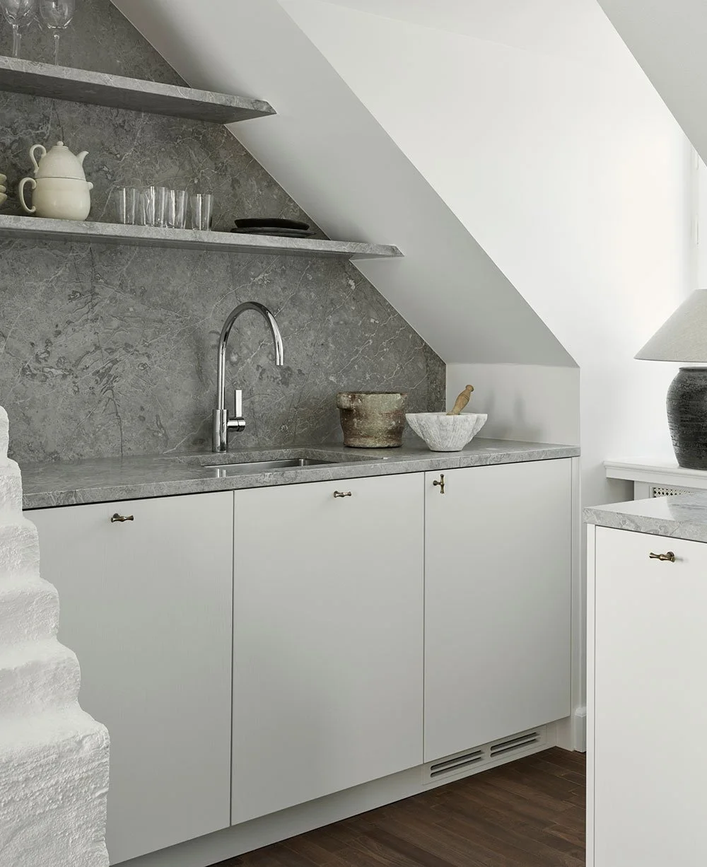
White-painted kitchen with solid wooden drawers on the inside. Plates, glasses, etc., are vintage, just like the lamp in the window. Get inspired by our white kitchens.
The wardrobe and pantry are site-built to fit exactly into the apartment's dimensions. The coffee table is vintage, just like the ceiling lamp. Discover ideas for kitchen decoration and details.
"We did a complete renovation, removing all traces of the early 2000s. We sanded the floors and the wooden beams on the ceiling, which were previously painted white. We built a wardrobe section from Nordiska Kök and a custom-built piece of furniture for the entrance. The bookshelf, which was built on site, is the biggest eye-catcher in the apartment," Christina says.
Discover our top 10 kitchen renovation tips.
"We extended the 'kitchen island' with the stove and oven beyond the standard 60 cm, partly to accommodate the sloping roof, but also to add pull-out cabinets behind it to maximize the space," Christina says.
The living room's interior design, featuring a beautiful natural color palette.
What was the most important thing when planning the kitchen?
Given that the only possible placement for the kitchen was under the slanted ceiling, functionality and ease of movement in the space became even more important than usual. We extended the 'kitchen island' with the stove and oven beyond the standard 60 cm, partly to allow for the sloping roof but also to incorporate pull-out cabinets behind it to maximize space.
Instead of upper cabinets we chose to have open shelves. Except that it created a slightly more appealing eye-catcher with the stone it actually created more storage possibilities. Plus, that it had felt very visually heavy with overhead cabinets.
Since the kitchen is not very spacious, we decided to paint it the same color as the walls to create a more monochromatic look. The stone became 'the statement piece' of the kitchen, yet still remained quite subdued.
Read our guide on how to plan your new kitchen.
Christina loves finding the right furniture and details, such as the dining table and chairs from Niels O. Møller.
The beautiful limestone climbs all the way to the ceiling.
How should one think in order to achieve a common thread through the renovation?
It is important to consider how the spaces flow and fit together and what function they fulfill. Her for example, it was important to bring in proper storage but that it still feels "designed" and not just like any storage space. We created different zones so it was clear what function each space has. It’s clear what is hallway, living room, dining room and kitchen.
I am personally very fond of natural materials and slightly dull colors so for me this becomes the common thread - the use of materials and its application.
Working with the natural conditions is also important. For example, in the main room there is a high ceiling with lots of light - this enhanced by bright colors on the walls. The bedroom is small with quite steep pitched roof. There, instead, we wanted to create a little cozier feeling and chose a really dark warm chocolate tone on the walls and ceiling as a contrast to the light.
"We used a painted treatment where the grain is visible through the paint, giving it a little more life and a slightly softer feel," Christina says. Discover kitchens in Scandinavian colors.
The bedspread is specially ordered in light wool. The headboard, made of velvet, is designed by Christina herself. The curtains are from Gotain, and the wall lamp, from the 50s, is from Etsy.
Tell us a little about WTP studios
WTP Studios is a small design studio where I primarily work on private residences. From design concepts to renovation, sourcing, and furnishing – just like I did here. I have a passion for old items, both from a design perspective and a sustainability point of view, so most of my projects reflect this, with a strong focus on vintage furniture.
I spend a lot of time sourcing the right products, with a focus on natural materials and a muted color palette. While I appreciate a sense of space without too much clutter, I still aim for the space to have character and patina, often with something a little quirky, even if it’s not immediately obvious.
See more kitchen inspiration.
Photo: Kristofer Johnsson


