Scandinavian Compact living by Agaton
The fashion designer Filippa Agaton, currently part of the design team at the popular brand Totême, has moved into her first apartment. With some help from her mother, the interior designer and stylist Lotta Agaton she renovated the apartment and installed a new Shaker kitchen from Nordiska Kök, specially designed and adapted for the small apartment. We had a chat with both mother and daughter about the successful renovation and the new kitchen.
See more of our shaker kitchens.
The small stove from Bora with a built-in fan is one of Filippa's favorite things about the kitchen. She was prepared to live with a large cooker fan above the stove and was pleasantly surprised when she did not have to.
If you are somewhat interested in interior design, you probably know who Lotta Agaton is. This super stylist who inspires us Scandinavians year after year. Now it's time for fashion enthusiasts to remember the name Agaton - Lotta's daughter Filippa has in a short time established herself as a promising fashion designer.
Last year Filippa graduated from Beckman's School of Design and her collection gave her a place among the finalists in the competition "Designers' Nest" which took place during Copenhagen Fashion Week.
Last autumn, Filippa bought her first own apartment, a cozy studio of 30 square meters with a high location in front of one of Stockholm's lush parks. The apartment, which dates from 1909, has beautiful stucco, large windows, almost 4 meters to the ceiling, old doors and a charming chest panel.
- I have had an interest in fashion and interior design for as long as I can remember and it has probably been conveyed from my equally interested mother. Therefore, ever since I was little it has been a dream to create my own home. It has been so fun to finally be able to make that dream come true, Filippa says.
Filippa collected material samples of the things she knew would be in the apartment and picked a wall color to match them. The kitchen then got a darker tone of the same color.
The apartment was completly renovated and in addition to put in new floor and to paint walls and ceilings, a new kitchen from Nordiska Kök was installed. The previous owner had the kitchen in the hall, but Filippa choose to move it to the living room to built a solid walk-in closet in the hall instead.
- Considering her profession, she needed plenty of space for the wardrobe. In addition, the large room becomes more social where you can cook and socialize with your guests at the same time, says Lotta.
Despite the fact that the space is so limited, the kitchen is very functional with a full-size fridge and freezer, oven, stove and dishwasher. The frame around the Shaker cupboards matches nicely to the panel along the wall in the airy turn-of-the-century room.
Since the apartment mostly consists of just one room, it was important that all amenities and functions were accommodated, at the same time, Filippa did not want to compromise on the feeling in the room. Nor did she want to deselect amenities such as a double bed and a large dining table. It would not feel too crowded either, a light and airy feeling was the idea.
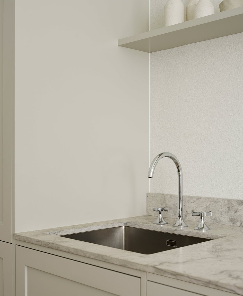
The Vaia water faucet from Dornbracht is actually designed for bathrooms. But Lotta tells that it is a smart choice in a smaller kitchen because it fits well in the dimensions. The countertop is a Thala gray. The windows in the room are also in gray marble and the two stones fit together nicely.
- Planning a small apartment is probably always a bit of a puzzle and of course you have to make some compromises to make everything fit. I felt pretty quickly that there were some things I did not want to compromise on at all.
- I wanted a large dining table with space for many guests, a proper kitchen and a good wardrobe. So to make it possible, I completely removed things that were less important to me, such as a sofa and TV, says Filippa.
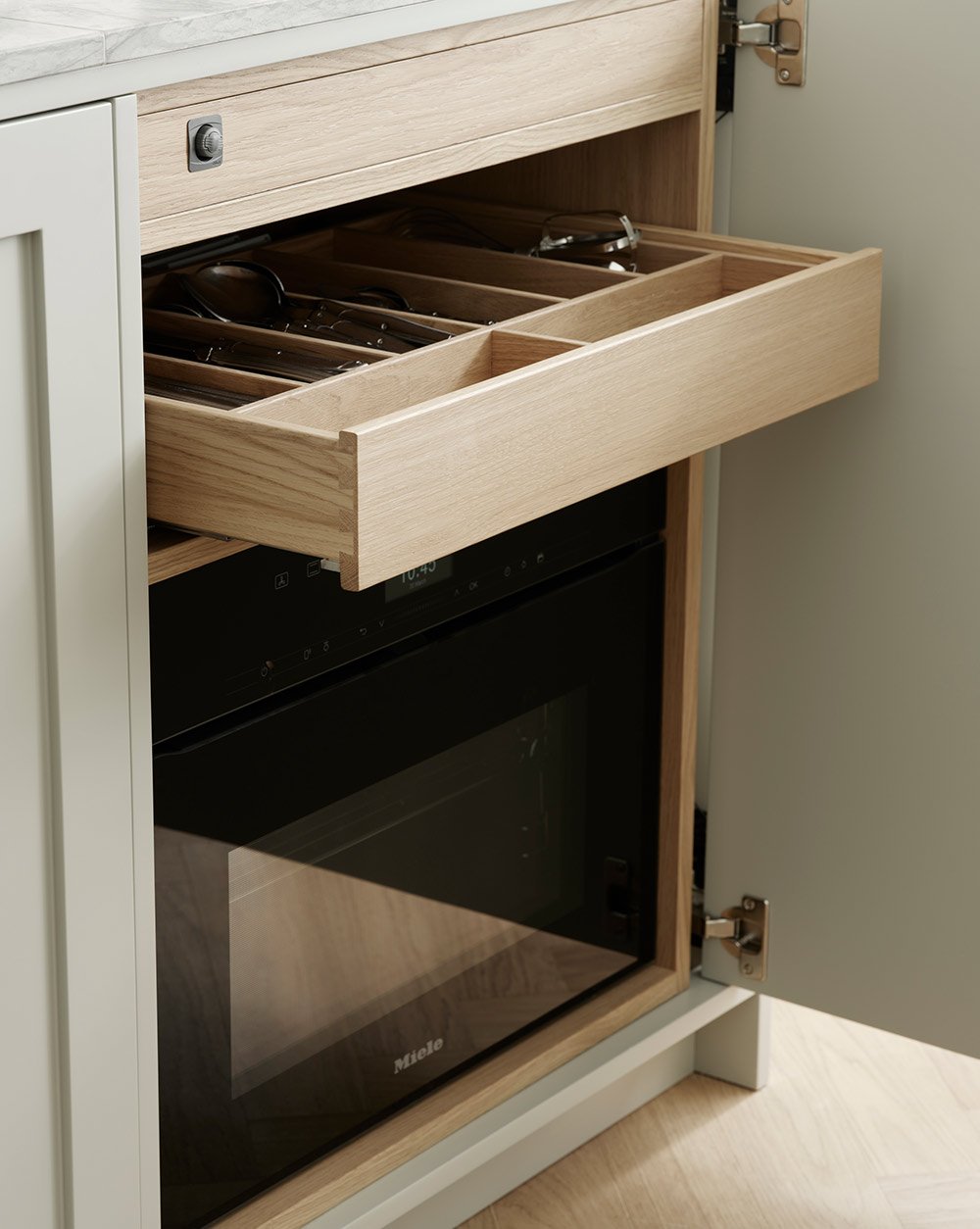
One of Filippa's fears was that it would feel like she was sleeping with her feet in the oven. This was solved by hiding the oven behind a cabinet pocket door. Above the oven, the cutlery also fits in the solid oak drawers.
Since the house is from 1907, she wanted the kitchen to fit the apartment's turn-of-the-century aura and the choice therefore fell on a beautiful Shaker kitchen.
- But classic shaker kitchens with many doors and knobs did not quite go together with the idea I had of minimizing the kitchen feel so we came to the conclusion that the best solution was to make the kitchen as stripped as possible and together we therefore chose to skip overhead cabinets and to have whole cabinet fronts.
The cabinets are made of white pigmented oak on the inside with solid wooden drawers, which matches nicely with the newly laid parquet. Under the sink there is space for waste sorting and cleaning supplies. Necessary features you want to hide.
The kitchen is neither large nor small, but just right. Fridge and freezer are found in a tall cabinet closest to the entrance to the room and then there is a row of benches where the cabinets hide waste buckets, dishwasher, oven and storage.
- It would make it not feel like sleeping with your feet halfway into the oven, Lotta explains.
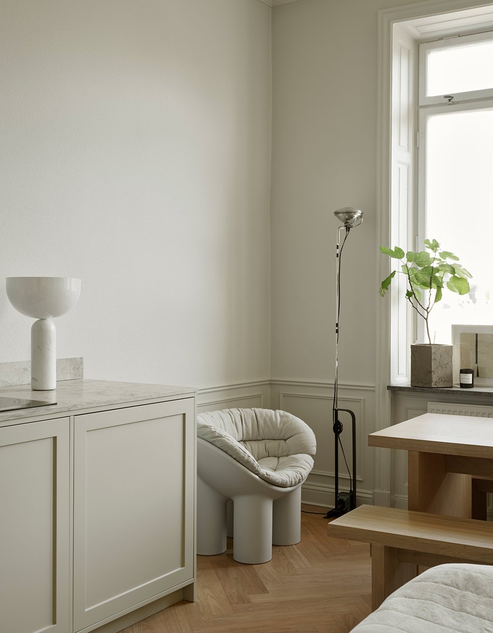
To get the storage that was needed but still not let the kitchen take over the whole room, the top cabinets were removed and a display cabinet at the dining table instead holds all the glass and crockery. In this way, there is plenty of space to cook and serve large dinners even though the apartment is 30 square meters.
To avoid this, Filippa chose to hide the oven behind a pocket lid and to completely avoid handles on the cabinets. Instead, there is a servo function that allows you to open all the doors by a gentle touch.
- It is important that a kitchen is functional, so you really have to think about how you cook and what your needs are, it is different for everyone. Maybe you need a lot of bench space or perhaps storage is more important? Reasons Lotta who was involved in planning the design.
Since the room is small and also holds a large dining table and a bed, Filippa wanted the kitchen not to feel too much like a kitchen while it still was important to have space for all the functions. By choosing not to have any upper cabinets or fittings, the kitchen feels more discreet and becomes a natural part of the room.
Since it is important for Filippa to be able to have guests over for dinner, the room was planned in such a way that there is a solid dining table with room for up to ten guests.
- Not having any upper cabinets felt important to make the kitchen look as little as possible like a kitchen. I have room for a pantry and pots under the kitchen counter, but all the crockery and all the glass needed somewhere to go. My grandfather who collects fine glass has always had display cabinets and I like it so much when you see all the glasses even when they are not in use, so a display cabinet felt like the perfect solution! I also like that the same doors and color come again in another place in the apartment, it contributes to the kitchen feeling like a natural part of the room, says Filippa.
Lotta Agaton has specially designed a dining table and two benches that allow you to sit ten people and have dinner together.
Both Filippa and Lotta are very happy with the result and thought it was incredibly fun to work on the project together. The limited space seems to have set the framework around the project which has been challenging in a creative and fun way. Lotta concludes by advising those who are going to decorate a small kitchen to think about functions and not to hold back when it comes to material selection.
Filippa's apartment has oak on both floors, tables and benches as well as the kitchen frames. The color palette is in beige gray. When working with different tones of the same color, it is important that they pull in the same direction, for example, you should not mix a beige that goes with a green tone with one that goes with a red tone. A great trick if you find it difficult to know what works is to stay within the same color code just as Lotta and Filippa chose to do here.
- When you decorate a small apartment, you often use the cheapest alternatives and material choices, but when it is such a small area, it is usually not so much more expensive to go for the best instead. You can buy extra nice switches when only three are needed, the same applies to floors - when it comes to 30 square meters, it does not make that much of a difference.
All kitchens from Nordiska Kök are available in any color and are completely adapted to the customer's wishes, all to create a site-built feeling without compromising on either design or function.
See all our shaker kitchens here.
Photo: Kristofer Johnson Styling: Lotta Agaton


