Pella Hedeby's minimalist kitchen
For stylist and interior designer Pella Hedeby, we have created a timeless kitchen that is both minimalist and full of character. The combination of the white doors and warm limestone creates an exciting contrast and gives the kitchen personality.
The interior designer, stylist and influencer Pella Hedeby in her home office.
Already when Pella saw the apartment, she decided she wanted the handmade Zellig Transparent White tiles from Stiltje. The faucet is from Nivito.
The stylist, interior designer, and influencer Pella Hedeby has, through her soft minimalism and subdued color palette, inspired interior design enthusiasts around the world for almost a decade. Eleven years ago, she started the blog Stil Inspiration, and through it, we were able to follow her development for ten years and learn to recognize her restrained yet warm style. Pella is known for creating timeless interiors with minimal means that feel harmonious and soft.
Her version of Scandinavian minimalism has repeatedly proven that minimalist design doesn’t have to be cold or harsh but can feel welcoming and soft. She creates this style using tones of off-white, beige, and gray, layered textiles, natural materials, and tactile surfaces.
Discover our minimalist kitchens.
The table is vintage with top and a base purchased from Temporärt. The chairs are Fredericia's J39 in soapy oak. Here you can see how important interior design is for the overall impression of a kitchen. Read our top tips on how to decorate the dining room.
In September 2021, Pella moved from her house in Södertälje to a nearby apartment, and has since renovated the apartment. For Pella, it is important to think long-term and make sustainable choices in all the decisions and changes she makes in her homes.
- I always strive to create interiors and expressions that I will not tire of. I can definitely be inspired by other materials and colors in a kitchen, but I always come back to white. So, it felt like an obvious choice, not least in combination with the design and material choices in the apartment overall, says Pella.
Get inspired by our white kitchens.
Pella chose solid wooden drawers throughout the kitchen in white pigmented oak. An option that is available in all our kitchens. Discover options for kitchen drawers and cabinets.
Initially, Pella had planned to skip the cupboards in the kitchen but decided to keep them in order to maintain the flow of the apartment. To create a symmetrical and calm impression, all the cabinets have the same width.
The apartment has large windows, and the kitchen is bathed in light. To soften the white, Pella chose beige Jura limestone with a beautiful, organic pattern. On the wall is a handmade tile from Stiljtje. Together, the tile and worktop form an interesting contrast to the minimalist kitchen doors. The apartment was relatively newly built, and Pella wanted to subtly erase the overly new feeling with small changes, which the tile really helps achieve.
Discover the best kitchen inspiration from our latest projects.
Pella's wish was for the appliances to take up as little visual space as possible in the kitchen, as it is a surface you pass when moving between all the rooms in the apartment.
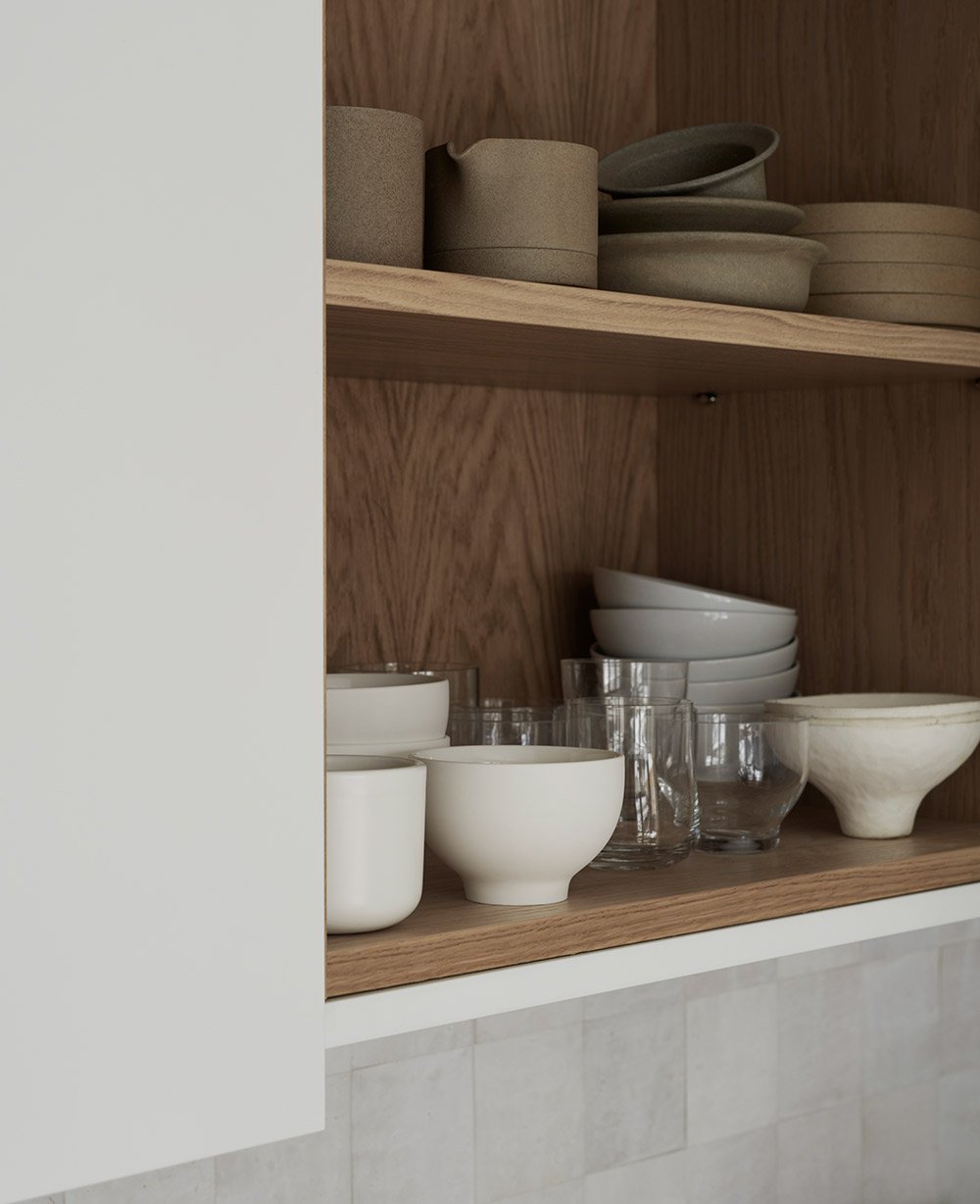
The insides of all cabinets and doors are in oak. Selected ceramics and utensils thus get a nice framing and display.
The interiors of all cabinets and doors are in oak, providing a beautiful frame and display for selected ceramics and utensils."
- I wanted the kitchen to be very much me, minimalist, simple and almost unpretentious with its clean doors. It was the balance I wanted, the one where the few selected details can set the character. I found the inspiration for the kitchen's character in Oscar Properties Katarina Västra Skola and the TypeO Loft.
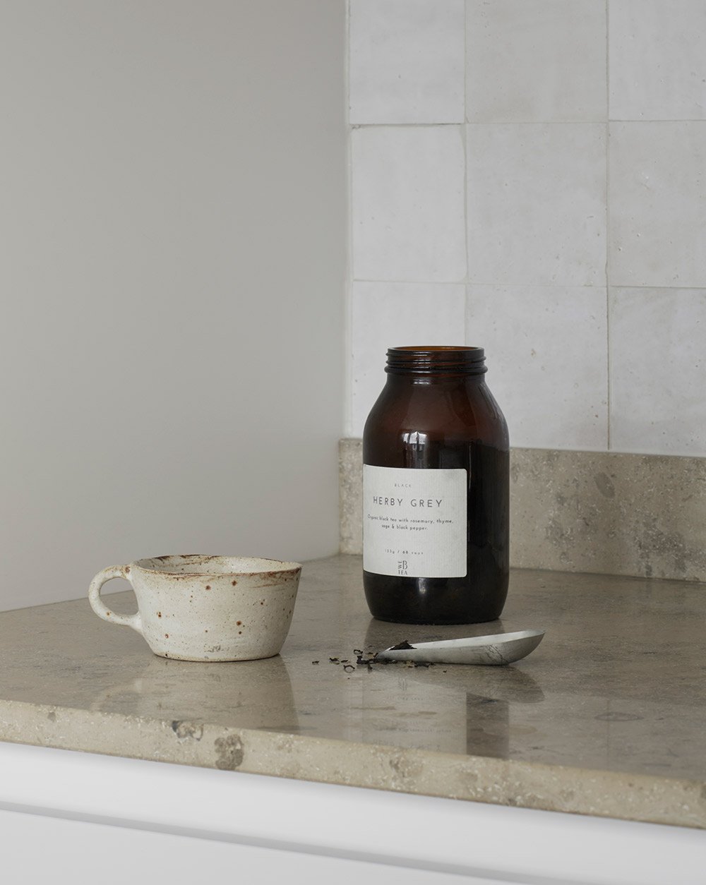
Brewing a cup of tea is a nice ritual that becomes extra harmonious in a beautiful kitchen. The Jura Grey limestone was chosen for the worktop – timeless, with natural variations, and its shades complement Pella's otherwise restrained color palette.
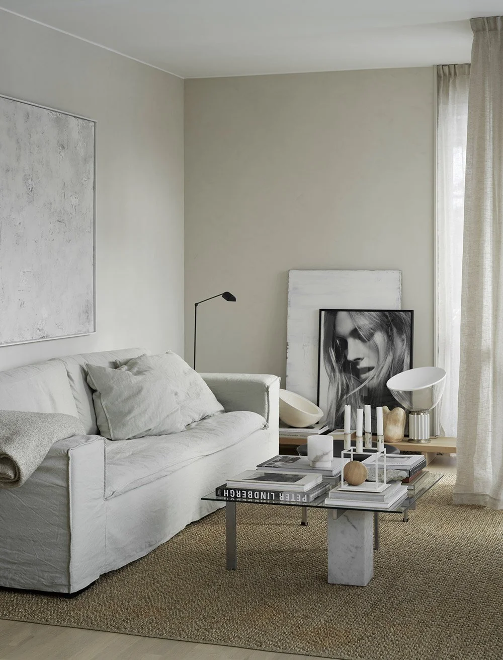
Pella is known for her timeless style and soft minimalism. She makes the bright Scandinavian aesthetic feel cozy and inviting by incorporating plenty of textiles, soft natural tones, and tactile accessories.
Another thing that is important for Pella is the inspiration from nature. This can also be clearly seen in the kitchen, for example in the oak that covers the interior of the kitchen cabinets or on the beautiful limestone top.
- I wanted a functional inside that would inspire to keep order. It is practical with pre-built compartments and the oak becomes a nice frame for my beloved everyday items.
Pella had "Light Therapy Kitchen" as her working name when she started thinking about her new kitchen. The doors are lacquered in a light tone and have been matched with handmade tiles. Together they reflect the light that comes from the large windows in the room.
Pella is most pleased that the kitchen turned out exactly as she wished and imagined.
- I had a clear vision and Nordiska Kök recreated it in more or less detail. The choice of interior drawers and custom-made oak compartments is my absolute best. I get happy every time I open them and they really make it easier to keep order and get an overview. And then I chose double cabinets for source sorting in nice stainless steel and practical vessels. Love them!
This nice kitchen shows that you can create magic with contrasts and that the low-key can feel personal and warm.
Photo: Kristofer Johnsson Text: Michelle Meadows


