The functional design kitchen in light oak
In a newly built house in northern Stockholm, we have built an inviting kitchen in white pigmented oak and stainless steel. The design is well thought out and offers large areas for storage, cooking and socializing. A dream kitchen that is as beautiful as the view of the lake outside.
Discover more of our modern wooden kitchens here.
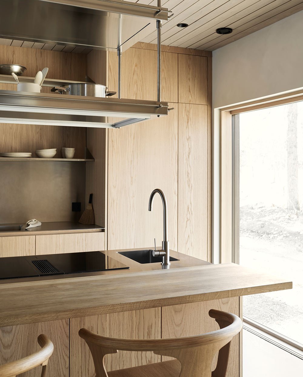
The kitchen is the perfect mix of industrial and design kitchens. In the middle of the room is the large kitchen island where Elin, her husband and their four children can fit in at the same time without any problems. Like the sink behind, the kitchen island is clad in stainless steel.
The kitchen is two steps up from the living room and dining room. On both sides of the room there are large glass sections that let the daylight in. Together with the wooden roof and the mineral-painted walls, the bright oak kitchen heats up the otherwise very minimalist room.
The dream of a house with a lake plot is something many of us share. Elin Södergren and her husband have made that dream a reality. Two and a half years ago, they bought a plot next to Lake Norrviken in northwest Stockholm and contacted the architect Henrik Sagen for help in designing their dream home. It is a modern house with lime-painted walls, a glazed wooden roof and a polished concrete floor.
On one side of the house you have through the large windows a view of Norrviken and the nature reserve which is on the other side of the water, and on the other side the family's lovely garden.
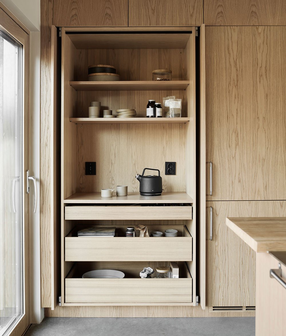
On the opposite side of the room from the sink is a wall with practical tall cabinets. The closest to the patio door is a pocket door cabinet with a well-used breakfast station and next to it there is a fridge and freezer.
There is a clear common thread throughout the home. Light colors, wood, layers of textiles and black accents. The family had the help of the decorator and stylist Pella Hedeby when they decorated the home. Read about Pella's own kitchen here.
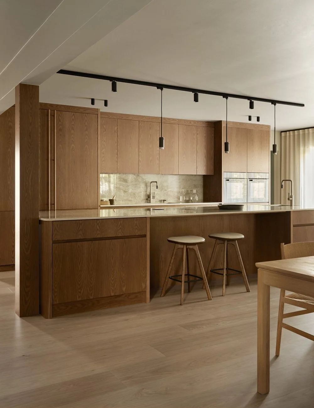
The home's living room has an open floor plan and the kitchen, dining room and living room are connected with a level difference between the kitchen and the other two room functions. Since the house is completely new, the couple had the chance to create their absolute dream kitchen.
- We were two who would like this project and we had very different wishes when it came to style. My husband wanted a functional restaurant kitchen and I wanted it to feel Italian and designed. Nordiska Kök helped us find the perfect design and now we are both super happy, Elin explains.
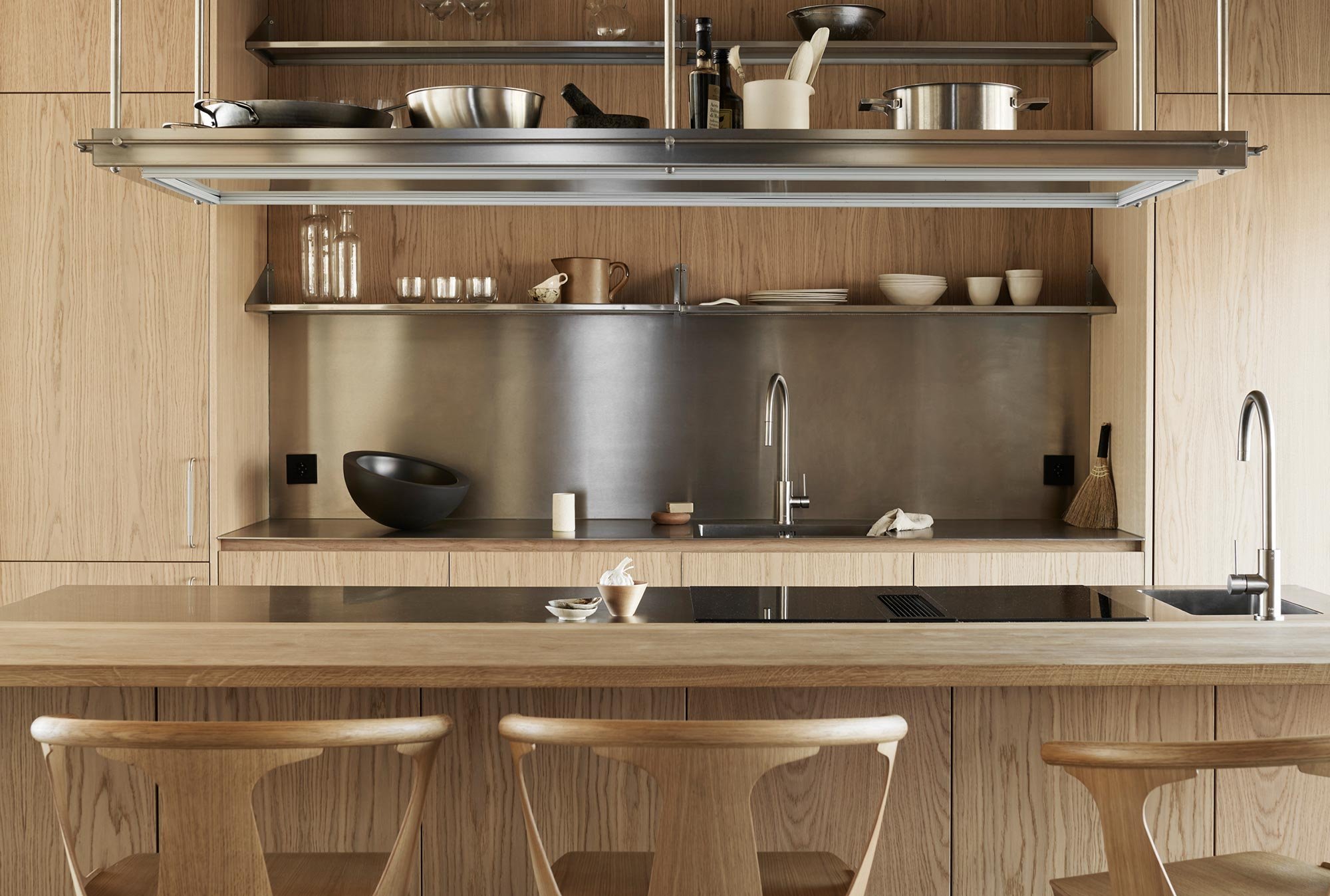
Above the sink are six stainless steel shelves. The everyday porcelain and other well-used kitchen items are stored here. The open shelves give the kitchen the industrial feel that the couple demanded. The handles on the fridge and freezer are called Helix and are from Beslag design. Get inspired by more stainless steel kitchen ideas.
The inside of the cabinets are clad in the same light oak as the doors. The solid wooden drawers give the kitchen an exclusive feel and make it more fun to keep order in the cabinets. In the knife drawer there is a nice effort to put the knives right.
In order for the newly built home, with its shiny concrete floor and large glass sections, not to look too sterile, a wooden kitchen was chosen. At the same time, it was important that it felt modern and matched the house so the choice fell on minimalist doors without frames.
For the wood, a beautiful vipigmented oak, they chose details in stainless steel that gave the kitchen the industrial feel and functionality you find in a restaurant kitchen. In addition to the worktop and splash guard, the shelves above the sink and the specially designed storage unit above the kitchen island are also made of stainless steel.
When the house was to be designed and decorated, they chose to work with black as an accent color. Among other things, all handles, switches, spotlights and electrical sockets are black. In the kitchen, it matches nicely with the stove from Bora.
The stainless steel worktop is thin and has a built-in sink. The design of the sink and the elegant finish on the top give the kitchen the Italian feeling that Elin wanted. Even the faucet from Primy are in stainless steel.
The room has cabinets along two of the walls and windows on the other two. One cupboard houses a breakfast station and the other an oven and a microwave. In the middle of the room you will find the kitchen island with four seats along one side and a hob and sink on the other.
The oak has a warm, light shade and an elegant expression that matches the frame of the window.
The oven and microwave are hidden behind a pocket cabinet next to the sink. By using a door with a pocket function instead of a standard cupboard door, you have a better overview of the food when it is cooked in the oven.
Most satisfied is Elin but the whole kitchen and that it harmonizes so nicely with the rest of the home. Guests often comment that it feels welcoming and homely, something you can thank the sociable design and the warm oak for.
The stainless steel splash guard reflects the light from the large windows. By focusing on two materials and letting them take over, you create a well-thought-out and well-designed feeling. The fact that the two materials are contrasts of each other also creates a wonderful tension that makes the room more interesting.
Photo: Kristofer Johnsson
Styling: Pella Hedeby
Text: Michelle Meadows
About the writer
Michelle Meadows has over 15 years of experience as a journalist and writer, specializing in design, interiors, and lifestyle. She has worked as an editor at Residence Magazine and contributed to several leading Swedish publications in the fields of lifestyle, fashion, and interior design—including Elle and Elle Decoration.


