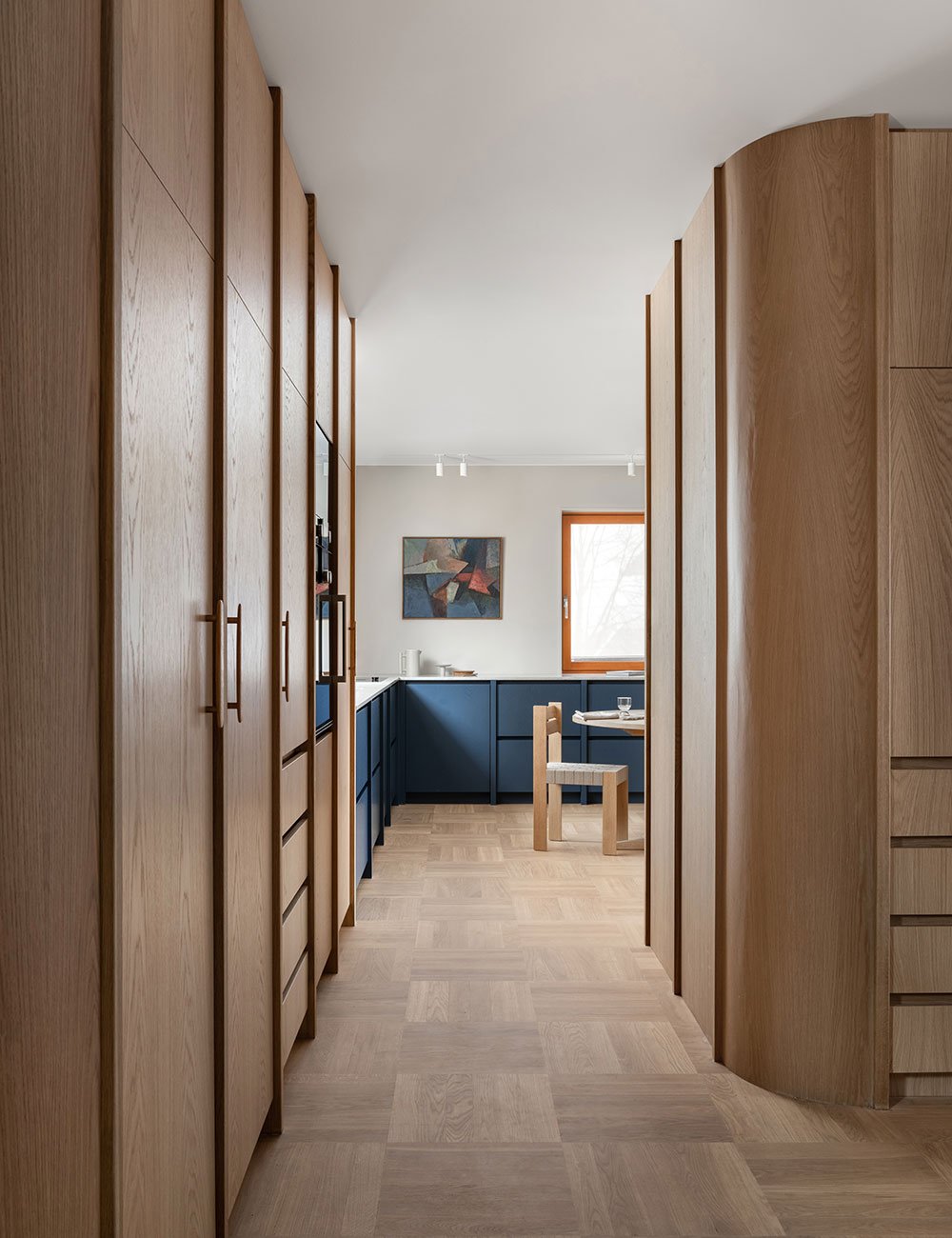
The Architect's retro kitchen in blue
Together with the Norwegian architect Ingrid Pay, we have created an oak kitchen that draws inspiration from the 60s and combines warm natural tones with an unexpected blue contrast that meets the demand of contemporary design and functionality.
Ingrid’s overarching interior style is Scandinavian with a forward-thinking twist. Here you get the quintessential muted neutrals and sleek elegance but paired with unexpected contrast. All her projects put strong emphasis on the connection between mathematics and arts, often showcased through lines – either sleek and straight or experimentally bold.
Warm oak and rounded corners in the 60s-inspired kitchen.
Blue display cabinet with lined glass and oak interior. Get inspired by our blue kitchens.
“Whenever planning a space, quality and timelessness are true core factors to me. I want to feel at home in this kitchen both this season and the next. I think it’s important to create solutions with longevity in mind. Our current home is from 1961 and really merges both the sixties and modern-day aesthetics.”
Beautiful original details are mixed with new design. Discover our top 6 kitchen decor ideas.
Ingrid Pay is a Norwegian architect who runs the architecture firm Pay Ark in Oslo.
The grandiose oak kitchen is one such example. For Ingrid, the main priority was to find a partner that were able to understand her creative vision. Additionally, the new kitchen would substitute a notable, 40-year-old solution.
– I wanted to create a custom-made and built-in kitchen space that doesn’t compromise with high quality. Nordiska Kök was the given option. Nordiska Kök were very precise, implementing each aspect of my very detailed kitchen vision, she explains.
Contrasting blue together with the warm oak and the beautiful quartz composite worktop Bianco Drift.
The cabinets with rounded corners and external frameworks are completely custom-made and reach all the way up to the ceiling.
Solid drawers in oak create a quality feeling in the kitchen.
Notable for this kitchen is its unique color palette. Overarching warmth, characterized by darker oaks, meets lively blues in a well-curated mix.
– I was longing for an old-meets-new kind of aesthetic while my husband wanted a charming, traditionally French countryside-influenced kitchen in green. Naturally, we had to compromise, and warm oaks with unexpected blues was the result. It is colorful, yet traditional and will stand the test of time.
The Brutus handles from Beslag Design are in the same neutral lacquer as the kitchen. Read our guide on how to choose the right kitchen handles and knobs.
The quartz composite worktop brings the contemporary into the otherwise 60s-inspired kitchen.
– We also prioritized the social aspects of a kitchen. The idea of a countryside kitchen really sparked the idea to go bigger, with an inviting kitchen table placed in the very middle. Contemporary spaces tend to be open and minimal, but we wanted that buzzy, homely feel. We see it as a natural meet-up point for the family.
Besides conscious color play, soft corners and tactile detailing truly stand out in this kitchen.
– A personal favorite is the door to the display cabinet, which is in lined glass. It elevates the space and you’re also able to see what’s going on behind there. I really like the rounded corners too; they are modern yet soft and build on the soothing energy.
You can sense the oak's beautiful grain in the blue color.
The kitchen continues hallway seamlessly into the hallway where wardrobes has been built in the same design as the kitchen cabinets.
Blue display cabinet with lined glass, something that Ingrid is particularly fond of. Read our tips on decorating with open storage.
For Ingrid Pay, it felt natural to pursue the architectural path. Her father worked in housing development, and early on she developed an interest for both building planning and designing. Today, she owns her own architecture firm, Pay Ark.
– As long as I remember, I have always loved to deeply indulge in my father’s drawings and as an architect, you do work very focused on projects. To me it’s hectic and exciting, but most importantly meaningful, ponders Ingrid.
Photo by Dag Sandven Text by Linnéa Ruiz Mutikainen


