Scandinavian design kitchen with an international touch
Once again, we have collaborated with the renowned interior designer Alexandra Ogonowski. This time creating a luxurious wooden kitchen in an Östermalm apartment from the end of the 19th century. Together with her colleague Jesper Nyborg, Alexandra has decorated and completely renovated the 147 square meter apartment for a customer whose wish was to create a calm and elegant base, which could then be personalized with the customer's own interior.
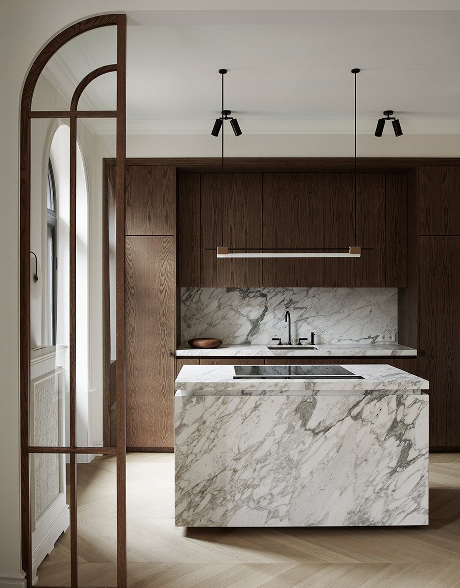
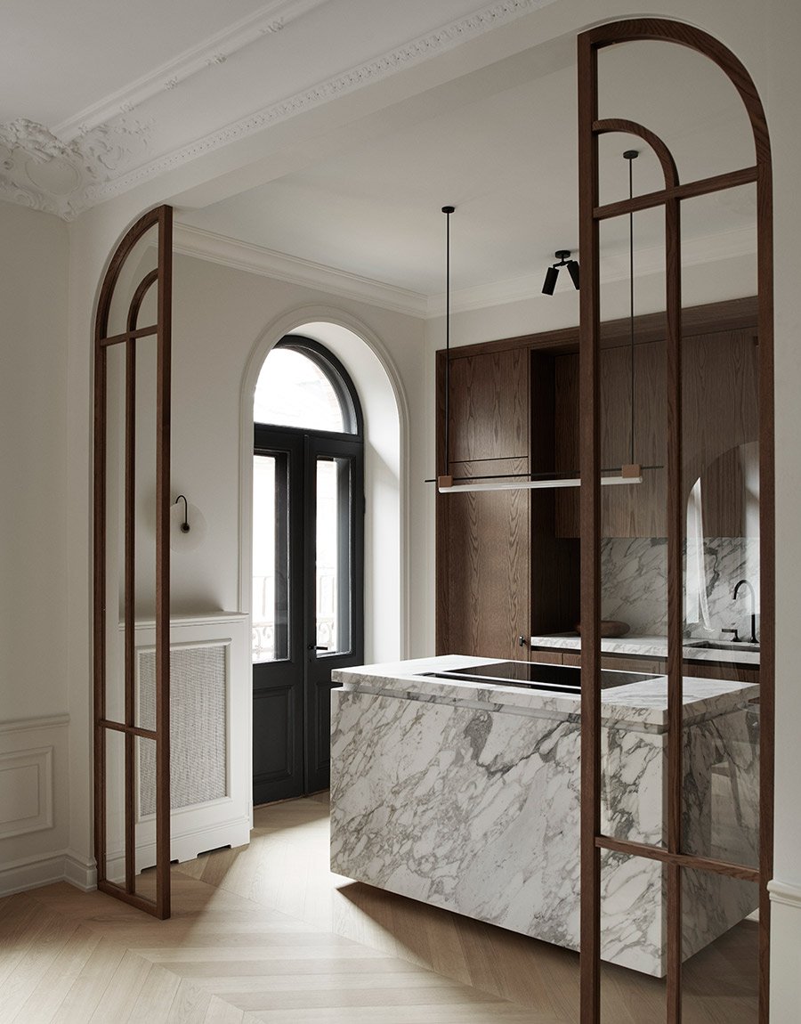
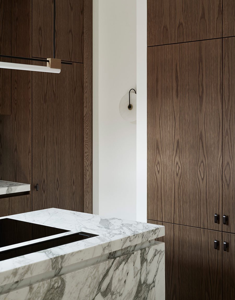
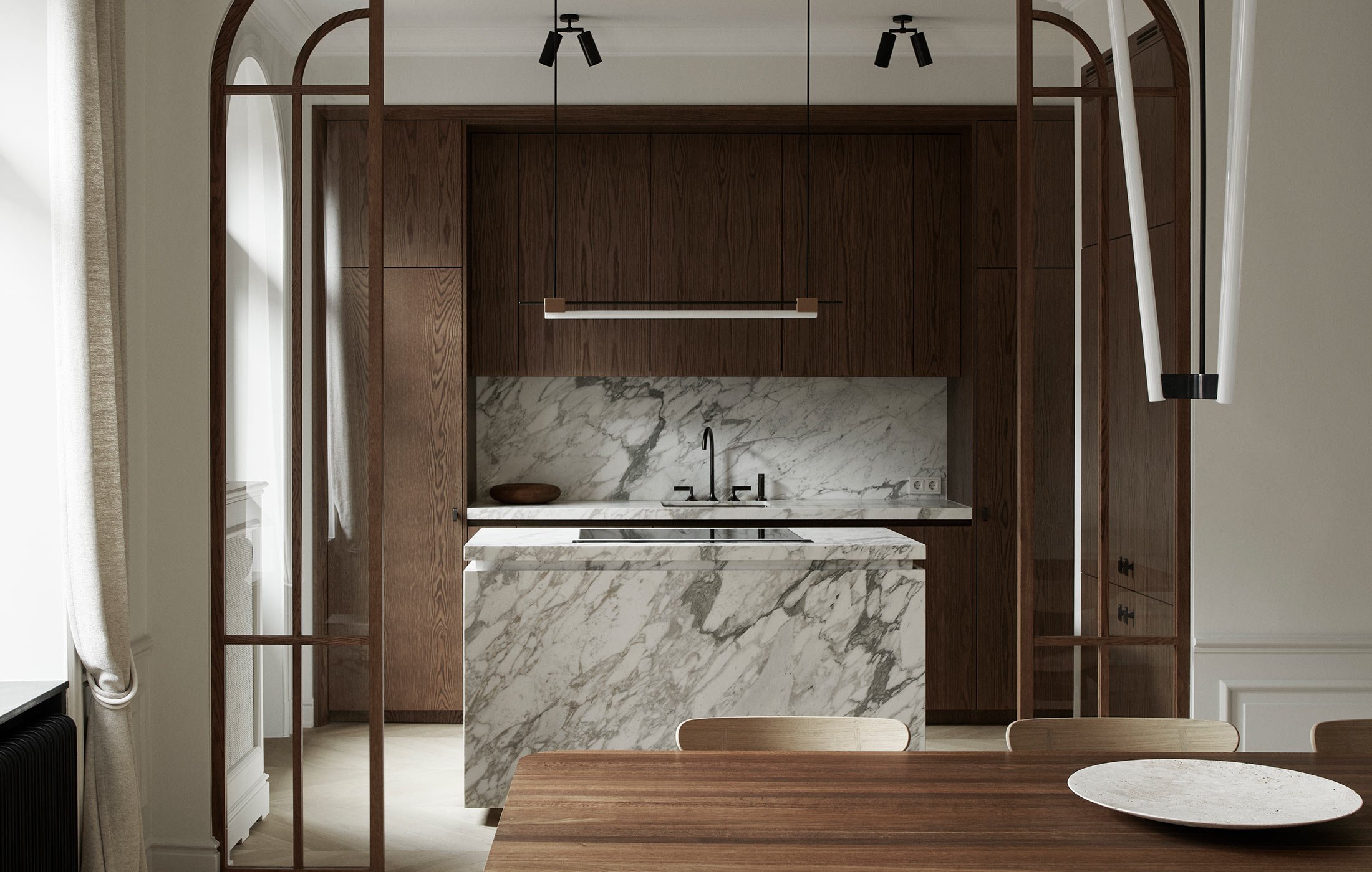
The large kitchen island is the jewel of the home. The customer wanted a gray-white marble with a lot of character and distinct grain and the choice fell on a Calacatta Vagli Oro marble from StenDesign. To create a beautiful shape, the side has a small break at the top and a marble sill at the bottom. With these simple means, the kitchen island gets an elegant and more tailored shape, in addition, it looks like it floats above the ground in a graceful way.
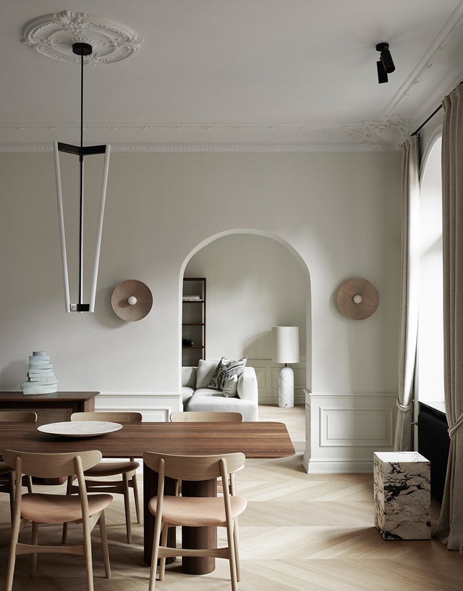
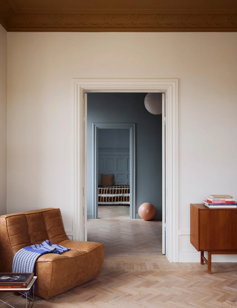
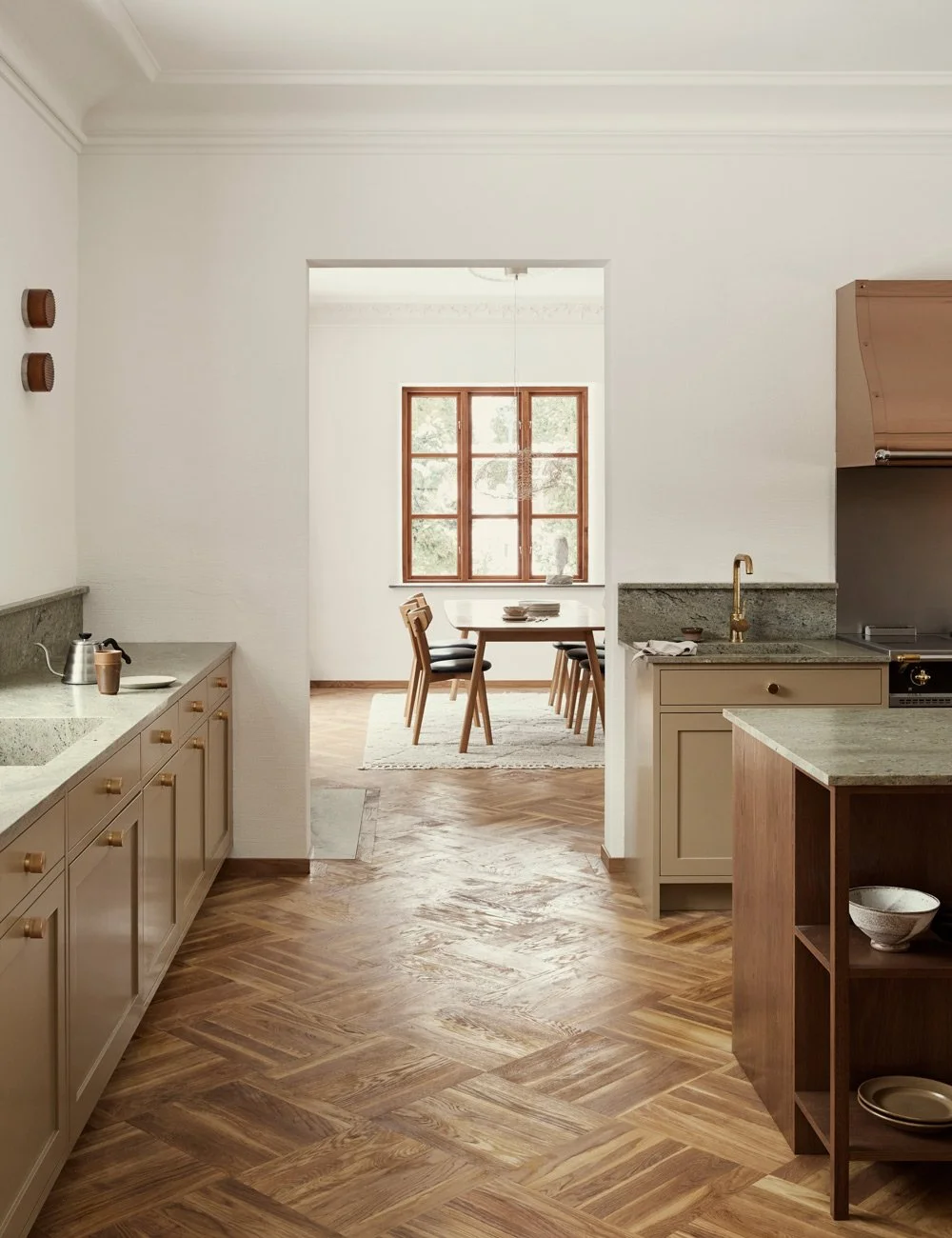
From the kitchen island you have a view of the generous dining room and further into the living room. A perfect room disposition for a social life with many guests. The view becomes even more inviting with the rooms having a clear common thread. All walls are painted in an off-white shade, the details are in light or medium brown wood, marble or black and the luxurious chevron parquet continues from the kitchen all the way into the living room.
The choice fell on a clean base with accents in marble and wood. The apartment has several period details such as stucco, tiled stoves and arched windows. This ornate architecture was the foundation and starting point for the renovation and interior design, where Alexandra and Jesper have chosen to mix the Scandinavian cool with French elegance to really let the apartment come into its own.
Discover our Scandinavian design kitchens.
The beautifully arched windows found in all rooms of the apartment were used as inspiration for the elegant glass walls between the dining room and the kitchen. To create a well-crafted and luxurious feeling, the arched windows have been stained in the same tone that matches the kitchen.
To create a clean look, overhead cabinets with a push function and worktops with a grip strip were chosen, so no fittings were needed. All accents in the home are in black, so a faucet in black from Dornbracht was chosen. The soap pump, stove and fan are also black. The lamp above the kitchen island is from Contain. By having a bench fan, you can invest in a beautiful luminaire instead of a boxy fan over the kitchen island.
Since the apartment is located at the top of the building and has an incredible amount of light, the large window frames and bars have been painted black. In this way, you avoid the home feeling too bright and fresh while creating drama and highlighting the beautiful windows that have acted as inspiration for several of the interventions made in the apartment. For example, large, arched glass sections have been inserted between the dining room and the kitchen, which both serve to connect and separate the rooms.
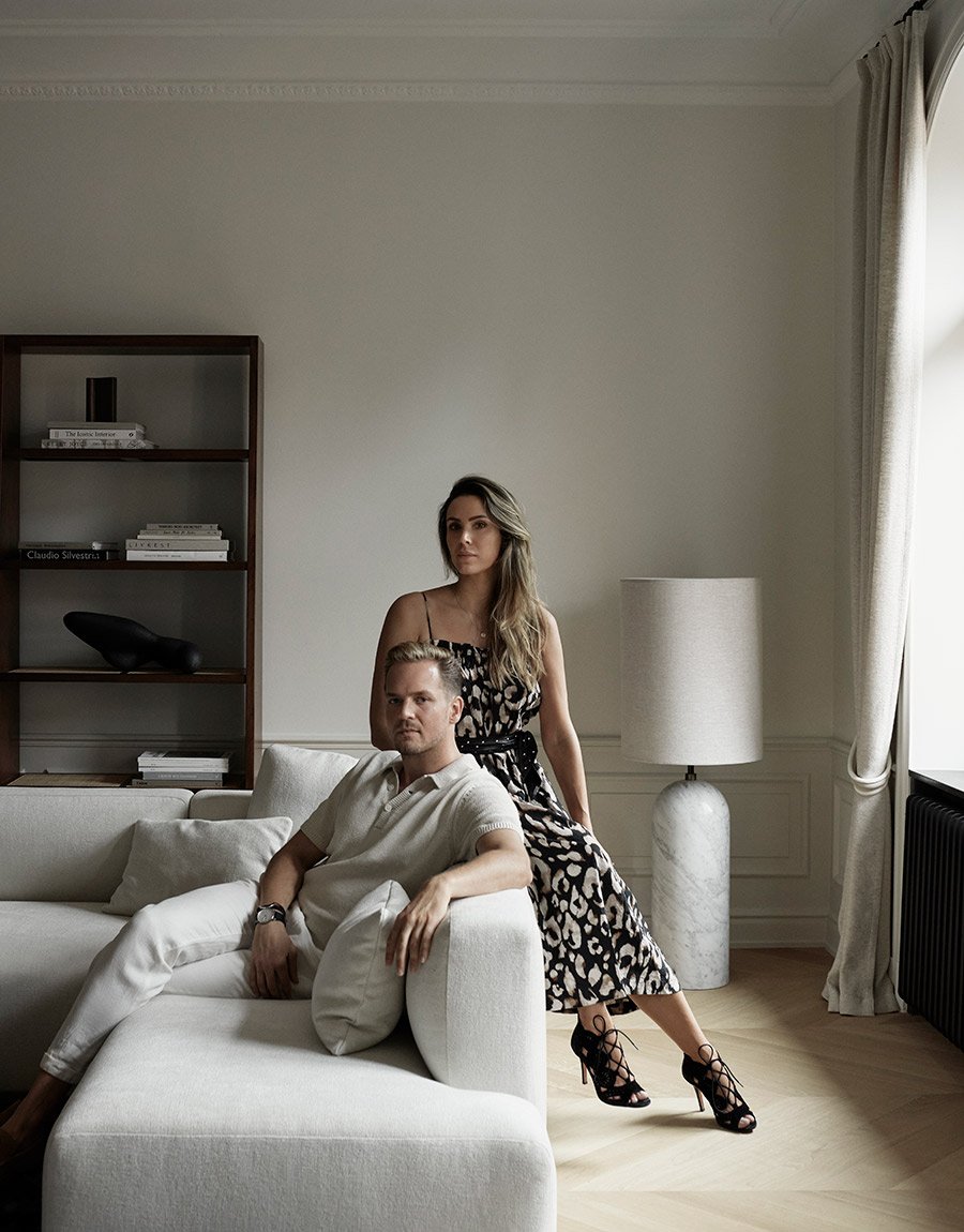
The interior designer and stylist Alexandra Ogonowski and the interior designer Jesper Nyborg make up AO/JN Interiors. Their interior design philosophy is to create simple, clean design and then sculpt the details to get a well-crafted, elegant feeling. In this home, they have consistently chosen to work with a mixture of the Scandinavian cool and luxurious French. To create dynamics, they have accents in black, wood and marble.
The whole home has a clear common thread and is a wonderful mix of French elegance and Scandinavian purity. The Chevron parquet, the wall panel and the broken white tone are classic French details, while the light, stripped-down furniture, the airy atmosphere, and the details in wood feel typically Scandinavian. Carpet Märta Måås-Fjetterström and table by AO/JN Interiors.
The home's living areas are in three rooms in line with the street. First comes the living room, then the generous dining room and at the far end you will find the kitchen. The kitchen itself has a limited area, so it was important that the design felt spacious, open and well thought out.
Since the apartment owner would like to be able to arrange larger dinners, a request was to have the kitchen lined out to make it easier on social occasions. Therefore, the kitchen has a large kitchen island that overlooks the dining room and a double set of fridge and freezer. The kitchen island has been given a recessed base, which makes it look like it is floating in the middle of the room, which contributes to an airy, open feeling. By choosing a bench fan behind the stove (which is found immersed in the kitchen island), you create even more space in the room.
Discover kitchen island inspiration and ideas.
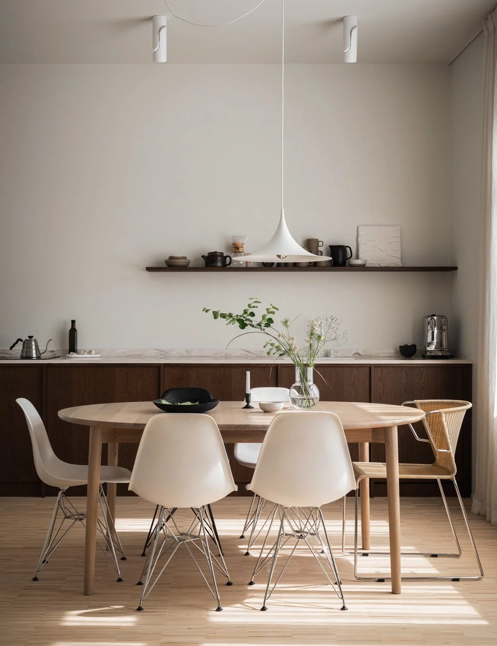
The dining room and the kitchen are nicely connected in the choice of materials and tones. Because they are placed so close to each other, they chose to have a kitchen island without seating - the chairs around the dining table are plenty. The dining table Hommage from Tre Sekel matches nicely against the chocolate brown kitchen while the chairs from Carl Hansen and Søn pick up the blonde tones in the wide chevron parquet. Read our best tips on how to decorate your dining room.
A double set of fridge and freezer is perfect if you tend to host large dinner parties or have group of friends over for brunch. Unlike the stripped doors above and below the workbench, the fridge and freezer have been given fittings. These come from Verveloet and are designed by Vincent van Duysen. Having the large kitchen island in front of the fridge is not only beautiful - it is very practical when unpacking and putting groceries away. Discover ideas for kitchen decoration and details.
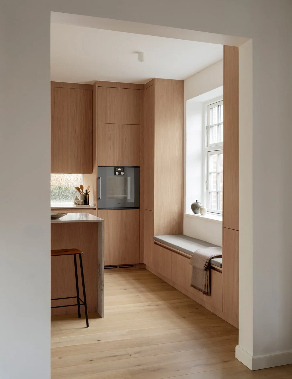
To the right of the kitchen island are the two refrigerators and freezers in two tall cabinets. They have been folded in and clad with doors in brown-stained oak. In this way, they get the shape and feel of a free-standing cabinet. Furthermore, the distance from the cabinets to the workbench and the kitchen island gives the room a symmetrical, spacious feeling making the room feel larger than it really is.
Along the far wall is a workbench flanked by two pocket door cabinets. The whole kitchen body has been recessed into the wall and along the edges there is a wooden frame with an angle of 45 °. It is the small details, such as the angled frame and the break in the kitchen island's marble top, that Jesper and Alexandra use when they want to make a stripped-down design feel more elaborate and custom made.
To get a beautiful view of the kitchen from the dining room, a symmetrical design of the kitchen was chosen. On each side of the workbench there is a pocket cabinet that can be folded in to extend the work surface if needed. In the right station there is a microwave and pantry and in the left a breakfast station with coffee maker and toaster. To the right of the room is a double set of fridge and freezer and in the middle of the room the elegant kitchen island. It is not only soothing with the symmetry, the design in this case also has a practical aspect. By planning the kitchen in this way, you have a reasonable distance between the stove, refrigerator, and sink. Discover our wooden kitchens.
All cabinets around the workbench have wooden doors, the upper ones with push function and the lower ones with a grip strip. The medium brown color and the beautiful grain make the kitchen feel elegant and give it an international touch. If you open the doors, the inside is clad in solid oak, which gives an added luxurious feeling. The worktop and the backsplash are in the same marble as the kitchen island and together they give the kitchen an elegant look.
Even though the kitchen looks very tasteful and spacious, above all, it was important that it was functional. All distances are therefore carefully planned. If you stand by the kitchen island, you not only have a perfect view of the dining room and living room - you also have the perfect distance to the sink, fridge and freezer. Here you can casually prepare the food while having contact with the guests at the dining table.
See more kitchen inspiration.
Photo: Kristofer Johnson
Interior project and design: Alexandra Ogonowski and Jesper Nyborg

