The Stylist's Minimalist kitchen
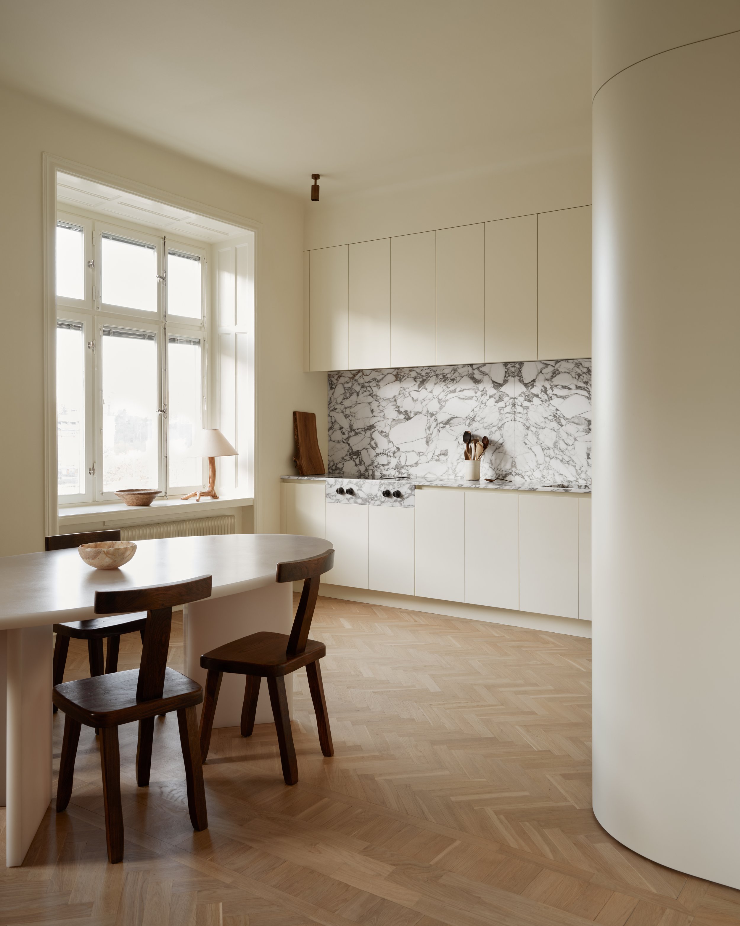
Together with the interior stylist Caroline Sandström, we have created a stylish design kitchen from Nordiska Kök that alludes Scandinavian minimalism. With tones of the warm color palette of the 70s, rounded corners and dramatic marble, a personal and elegant expression is created.
With tones of the warm color palette of the 70s, rounded corners and dramatic marble, a personal and elegant expression is created. Discover kitchens in Scandinavian colors.
Caroline Sandström has a strong visual identity.
Stockholm-based interior stylist and set designer Caroline Sandström has a strong visual identity. It was first displayed through imagery and writing, as Caroline’s career path started in fashion journalism and styling. Over the years, her interest leaned stronger towards interiors, discovering her own signature style, mixing monochrome minimalism with modern details. Today, she runs her own design- and interior studio, Concept Studio Blasiak, creating timeless interiors based off her unique aesthetic.
Caroline's take on Scandinavian interiors is simple and cohesive yet filled with elements of surprise. Each project, both her own and for her clients, are different, merging typically Nordic with elements of functionality and warmth.
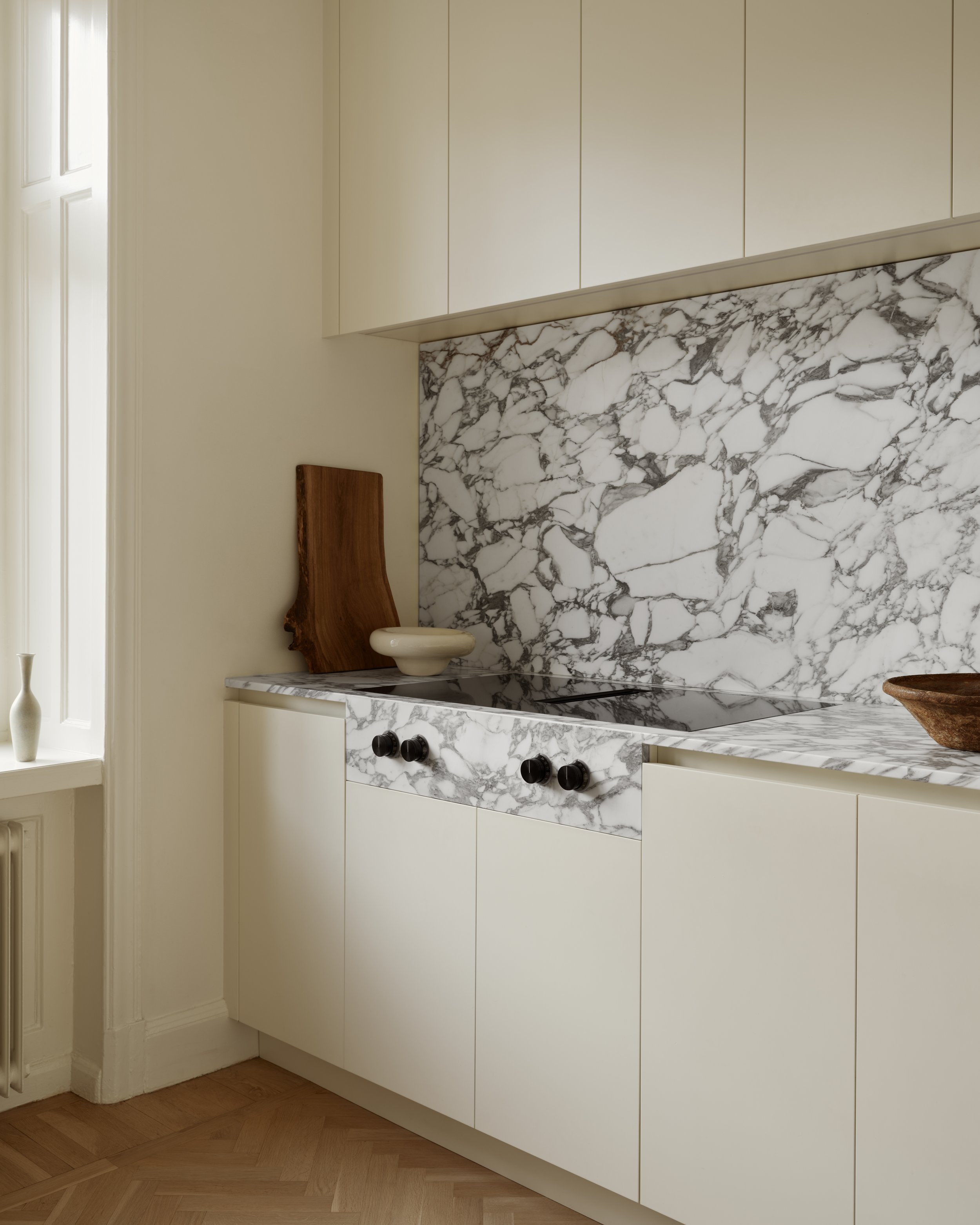
The tailor-made back splash in dramatic marble creates a contrast while making good use of the kitchen’s spacious height.
The rounded cabinet with insides in white-pigmented oak. Read our tips on decorating with open storage.
“I often start from the Scandinavian expression at the base of my interiors, which is noticeable in the color palette. It is often neutral. Then I experiment a lot with shapes and different expressions in furniture and details and choice of materials. I love Italy for its forms and the French brutalism from the 50s, 60s and 70s, which I mix in furniture and take inspiration from. I want all the rooms in the home to capture the mix between old and new and different styles, which in turn create a nice balance, Caroline explains. I like when you can't really put your finger on the style – you shouldn't really be able to explain it – but it is what it is.”
Read our tips on how to decorate the minimalist kitchen.
“I want all the rooms in the home to capture the mix between old and new and different styles, which in turn create a nice balance, Caroline explains.”
“I wanted a bit of 70s interiors, yet contemporary and simple to decorate with.”
The minimalist design kitchen that Caroline designed together with us shows that minimalism comes in many shapes, preferably with unexpected contrasts that enhance the Scandinavian feel.
Discover our minimalist kitchens.
“I love when companies are solution-oriented and that is exactly what Nordiska Kök is. They are keen to listen to my ideas and willing to implement them. The collaboration flowed well from the start, and I am so satisfied with the result. The kitchen became minimalistic but with the right details which, in my opinion, make it interesting and exciting”, says Caroline.
Exclusive faucet from Vola in the beautiful marble-clad sink.
Appliances are hidden behind cabinets and cupboards.
“I wanted a creamy white, almost yellow-oozing canvas. Think a bit of 70s interiors, yet contemporary and simple to decorate with. I like how the marble adds contrast without feeling empowering. It complements the minimalist kitchen cabinets well, Caroline explains.”
The kitchen, just as the apartment in general, contains plenty of functional solutions. The tailor-made back splash is tall and slim, creating contrast while making good use of the kitchen’s spacious height. One of Caroline's personal favorites is the rounded edge corner, making the kitchen space feel even larger.
“We removed the wall between the kitchen and living area. I wanted something softer than the traditional straight edged corner. This rounded option connects the rooms more naturally.”
The tailor-made back splash is tall and slim, creating contrast while making good use of the kitchen's spacious height.
Notably, Caroline's home is filled with smart detailing. Each component is there for a reason, particularly noticeable in the kitchen space, with custom-made storage and built-in equipment.
“I like maximizing the space when decorating. In the kitchen I focused on the forgotten corner, the part of the room that’s rarely used to its full potential. We opted for a built-in coffee machine, integrated in the kitchen solution, which matches the ambience well.”
See more kitchen inspiration.
Photo: Kristofer Johnsson Words: Linnéa Ruiz Mutikainen Styling: Caroline Sandström


