The pink minimalist kitchen
Interior designer Gabriella Gullberg was recently commissioned to decorate a beautiful house that has not been renovated in over 40 years. Several of the functions in the house were adapted to a different lifestyle than most of us have today and thus needed to be updated.
The kitchen was dark and cramped so in order to create a modern kitchen with room for family life and entertaining, Gabriella combined four smaller rooms to create one large and airy area with windows in three directions.
The new kitchen is bright and spacious and is designed for family life and cooking. It is truly the heart of the home and makes the house more social.
By one of the windows there is a small bench with a seat in amber-colored leather and a black metal cafe table. The little nook is perfect for a quick breakfast or a cozy cup of tea.
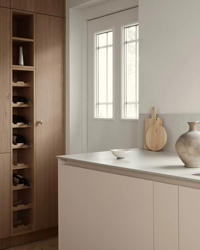
A wooden kitchens was selected, but instead of just staining the doors, they have been painted in an apricot pink tone. The semi-transparent varnish allows the grain of the wood to shine through which gives the kitchen a warm expression. In addition, it matches the tall cabinets in white-pigmented oak.
- I set a color scheme for the whole house and that included the color choices for the kitchen. The warm, apricot pink was tested on site to create the perfect hue. I then paired it with the white pigmented oak, a warm white on the walls and burgundy and amber for the smaller details, says Gabriella.
White pigmented oak and painted oak in a warm apricot pink tone.
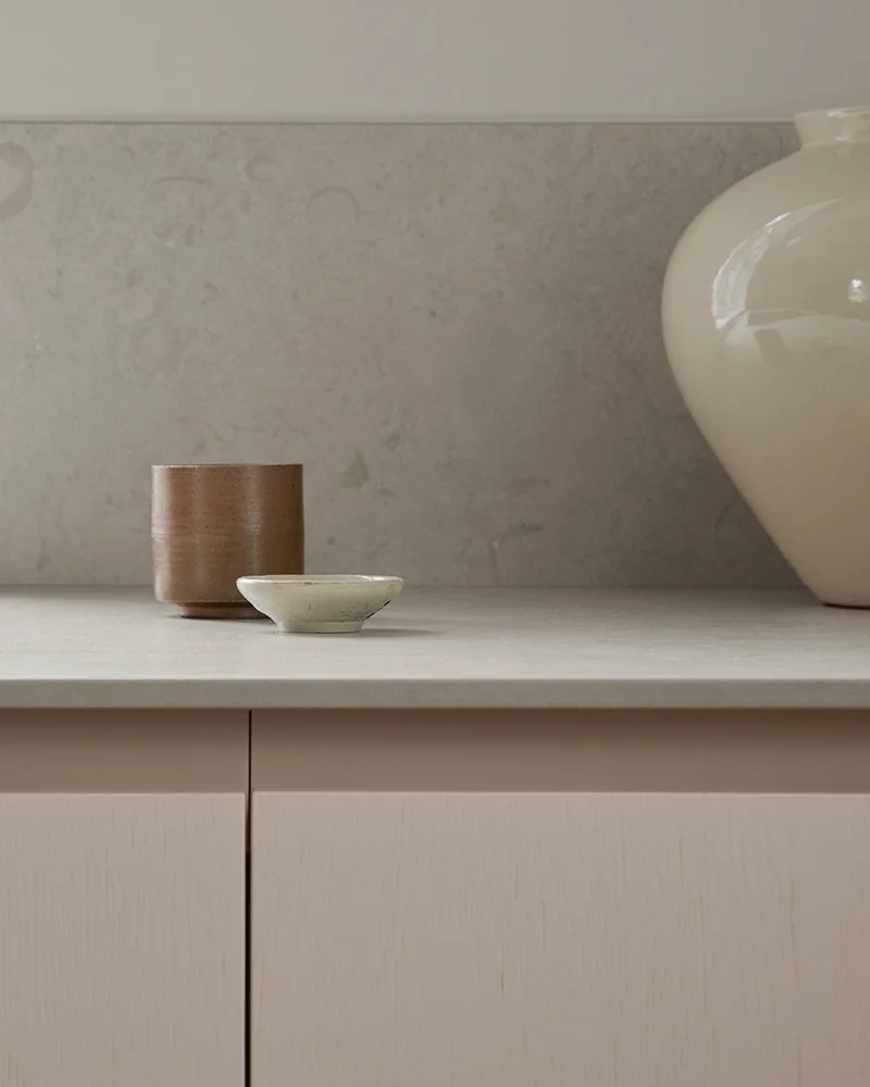
Norrvange ceramic countertop from Bricmate
“The warm, apricot pink was tested on site to create the perfect hue. I then paired it with the white pigmented oak, a warm white on the walls and burgundy and amber for the smaller details”
The generous space of almost 30 square meters makes room for a dining table in the middle of the kitchen and allowed to exclude upper cabinets. This way, the soft light from the many windows bounces off the walls and the room is bathed in light throughout the day.
Along one of the walls there is a row of tall cabinets to ensure that there is enough storage despite the lack of upper cabinets.
Interior designer Gabriella Gullberg.
The idea of the design was to create a practical and useful kitchen that looks sleek and inviting. This was achieved by hiding the drawers behind cabinet doors and adding a series of floor to ceiling cabinets that hide all kinds of kitchen items, as well as a pocket cabinet that is used as a coffee station. The straight, uninterrupted lines, the lack of visible kitchen supplies or appliances, as well as practical functions makes the room feel very well-designed and calming.
In order to get exactly the right tone, the apricot pink was test painted in the room before applied to the cabinet doors.
Pocket door cabinet in white pigmented oak with solid oak drawers.
The Norrvange countertop and splash guard are made of ceramic from Bricmate. Besides being very practical, the organic pattern of the ceramic is calming, and the surface reflects the light from the windows beautifully.
- I am very satisfied with the way the colors interact with the materials to create a harmonious atmosphere in the room. The feeling you get when you enter is relaxed and peaceful, which is due to the combination of the light, the materials and the colors – a formula you always want to achieve when you decorate, and that I think I have succeeded with here.
The inside of the cabinets is in beautiful white pigmented oak that match the newly laid herringbone parquet. The small coffee station has been fitted with pocket doors that can be easily folded to hide all the things behind.
The tones are warm and inviting and fit nicely together in this interior project by Gabriella Gullberg.
In order to create different functions and stations in the large room, a cozy little sitting area has been built in the most secluded part of the kitchen.
- It's like an oasis in the kitchen with a coffee station behind pocket doors and a bench with a small table and a leather seat cushion. You can sit there by yourself but still keep an eye on what is going on in the house. A rather unique little corner, Gabriella concludes.
Step into Gabriellas own terrazzo kitchen here, and visit her instagram for more inspiration.
Foto: Kristofer Johnsson Styling: Caroline Sandström


