The architect's design home
Rarely has an episode of SVT's house renovation program "Husdrömmar" been as talked about as the one at the home of the architect Henrik Schulz and his girlfriend Lina. Gert Wingårdh himself exclaimed "Finally!" at the end of the program and said that it is the first time any of the families builds the archetype of a modernist house and executes it according to all the rules of art.
See more of our wooden kitchen inspiration here.
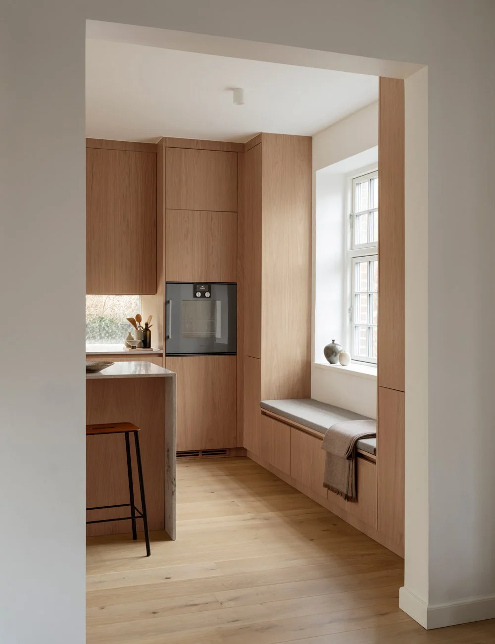
Henrik Schultz has studied both architecture and furniture design. Together with Nordiska Kök, he has designed a kitchen that looks like an elegant piece of furniture.
The home is a two-storey house on a hill in the popular residential area Hovås just south of Gothenburg. The house was designed by the architect Henrik Schulz himself and his girlfriend Lina and has been named after the couple's two-year-old daughter Clara. Henrik and Lina themselves mention that the original idea came from the Balinese yoga shalas that they both visited and loved and that the shape was then inspired by contemporary Brazilian architecture, including Marcio Kogan.
The house is built of a steel construction with large terraces and overhanging roofs which are beautifully decorated with oiled cedar and large glass sections. The large windows are in powder-coated aluminum constructions and in order to be able to carry the weight from terraces and roofs, you can sense the metal construction in its places. A clear reference to the mid-twentieth-century California Case Study houses that have become so iconic and continue to inspire architects around the world.
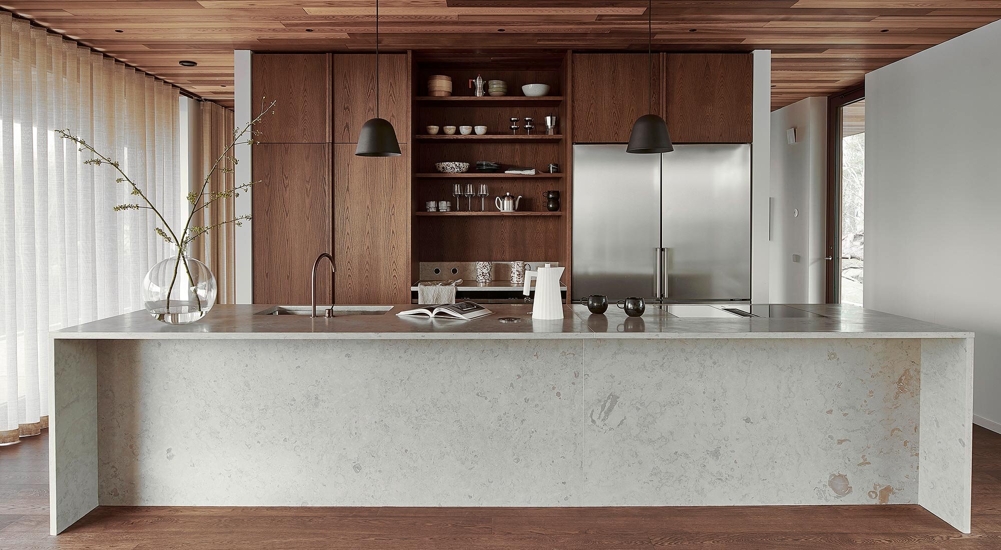
The light is filtered beautifully through the curtains onto the kitchen island and the limestone countertop. The sculptural faucet in copper is a unique find from Vola's factory and becomes a jewel in the kitchen.
Here, the family has not compromised on either quality or vision and everything from the facade to the kitchen is well thought out down to the smallest detail. A true house dream.
The kitchen is a real design dream where Henrik summed up everything he learned by designing kitchens for his customers over the years. To help him, he has had us at Nordiska Kök to finalize the vision for the bespoke kitchen.
- I have always dreamed of a big kitchen island. My experience is that no matter how big you make it, it is still never enough. So this time we made the kitchen island almost 5 square meters large, says Henrik.
He and Lina wanted a social kitchen where you can work two people at the same time without running into each other, while socializing with guests and supervising Clara.
Hidden sliding doors to close the office from the living room if desired. Open light and air flow through the house and create space and openness. The stained kitchen doors match both the oak parquet and the ceiling in cedar wood.
You can really tell the kitchen is designed by an architect who does not compromise on the details. Everything is symmetrical, clean and airy and the mix of dark stained oak, limestone and copper is so delightful beautiful to look at.
“- I have a long experience of drawing kitchens and have planned several kitchens together with many different suppliers. I feel that I have finally found a good long-term partner in Nordiska Kök. The collaboration has worked flawlessly. Finish, details and the overall price picture have made me look no further and I hope we can work together many more times.”
The elegant kitchen will be the central hub for the family to socialize and a perfect place to gather friends.
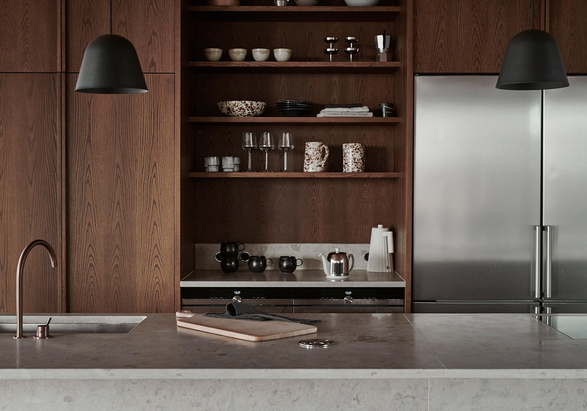
Just as Henrik made a schedule for how the sun moves over the building to be able to construct a terrace and roof, he and Lina made a schedule for how they move in the kitchen. That schedule then helped them to plan the placement of the kitchen's various functions in the most optimal way as possible, while at the same time the kitchen had to be beautiful to rest its eyes on. A gourmet architect who hates to compromise obviously did not want a large bulky fan above the stove so the couple chose to install an integrated bench fan from Bora.
In the large limestone-clad kitchen island there is a large sink of 80 cm. The fact that it is so wide means that you can easily wash plates and larger pots. As a piece of jewelery, they have then matched the stone with a tap from Vola in brushed copper. A tap that is actually unique and was found during a visit to the company's factory.
Henrik and Lina met three years ago and when they had a daughter Clara, they felt that they wanted to move house. When Henrik ran on the plot in Hovås, they decided to build their own house dream.
Henrik has designed many kitchens for architect customers and says that he has always loved kitchen islands but that you always want them a little bigger. Therefore, in his own home, he has designed a kitchen island that is almost five square meters.
If you look closely at the kitchen, you can see there is an architect who is also a trained furniture designer living here. The whole kitchen island is like a super elegant piece of furniture. On one side it is clad in limestone and on the other it is divided into a row of equally wide cabinets with doors in stained oak.
Behind the kitchen island there is a wall with a stainless steel refrigerator and a freezer, high cabinets with wooden doors, open shelves and two ovens under a workbench. On each side of this body you can pass towards the entrance and stairwells and offices and bathrooms. It makes it feel airy and minimal while accommodating all the things that belong in a kitchen.
The large cross that holds the construction together becomes a nice detail on the short sides of the house. The custom-made curtains can be pulled back if you want to feel more private. Outside, however, hedges will be built that will eliminate visibility from the street.
The materials have been chosen with the utmost care and perfectly match the surroundings outside the house. In the bathroom, Henrik has specially designed a sink completely in stone.
The dominant material choices in the house, wood and stone, also surround the building, which is located on a pine-clad stone hill.
Villa Clara is incredibly well built and well designed and even though the house was designed with the own family in mind, it will probably be loved by future generations to come. The house is built in the basement and downstairs there is a sauna, laundry room, a small guest room, two bathrooms, an entrance hall and two large bedrooms.
In addition to the office, the upper floor consists of a large social room with both kitchen, dining room and living room as well as a large bathroom and an entrance hall. The entire floor has an incredible view of the residential area and the surrounding pine forest. It almost feels like you are in a tree house. A super-luxuriously designed tree house.
Just as the house is a successful meeting between the American Case Study architecture and Scandinavian minimalism, so does the furniture of Hans J. Wegner. All colors in the home harmonize and the love of quality also is seen in the interior details.
Henrik Schulz himself is a real perfectionist who loves quality and prefers not to compromise at all when it comes to details. Therefore, he has consistently chosen to meet the industrial steel construction with beautiful natural materials loaded with feeling and elegance.
The tree species are consistently warm and perfectly match the pines outside. The roof both in the house and on the terrace is in cedar and you can imagine how good it smells indoors. The floor is stained oak parquet and all details in the rest of the house are also those in stained oak.
For the wood, Henrik and Lina have chosen a gray beige limestone that reappears in both the kitchen and bathroom. The Norrvange limestone comes from Gotland and was chosen partly because of its beautiful color and pattern, partly because it is from Sweden and has not had to be transported that far. In addition, it is reminiscent of the stone on which their house and the surrounding forest stand.
Photo: Andreas Sundgren www.andreassundgren.se
Styling: Sophia Bratt www.sophiabratt.se
Architecture by Henrik Schulz www.henrikschulz.se
On our Instagram @nordiskakok you will find all our latest kitchen projects.
On Pinterest we have created a whole board with all our wooden kitchens, here you will also find the latest inspiration for wall paint, faucets, tables and chairs!

